

What these settings control
- Whether color options show as swatches or as text.
- Which option names Facet treats as colors.
- The color shown for each color name.
- The corner shape of option boxes and swatches.
How to access
1
Open the Theme Customizer
In your Shopify admin, open Online Store, then Themes, and click Customize next to Facet.
2
Open Theme settings
Click the Theme settings icon in the left sidebar.
3
Open Variants
Expand Variants. Open a product with a color option in the preview to see your changes.
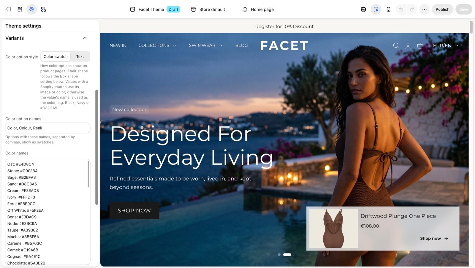
Variant settings
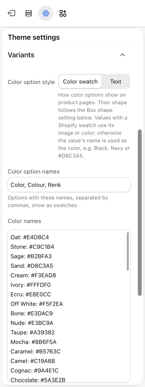
Color option style
Color option style
- Color swatch (default): color options show as small filled boxes. Product cards show a row of swatches under the price.
- Text: color options show their names, like any other option, and product cards show no swatches.
Color option names
Color option names
The option names that count as colors, separated by commas. Default:
Color, Colour, Renk. Capital letters don’t matter.Add the name you use in your products if it is not in the list, for example Shade or Kleur. With the Color swatch style, values that have a Shopify image swatch also show that image, whatever the option is called.Color names
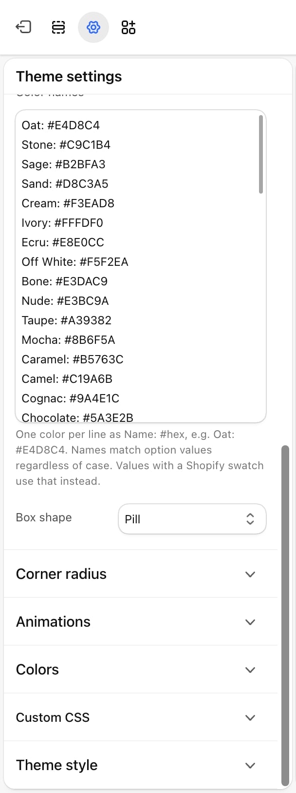
Color names
A list that tells Facet which color to show for each value. Write one color per line as
Name: #hex, for example Oat: #E4D8C4. Facet comes with a list of common fashion colors, such as Sage, Camel and Navy, that you can edit or extend.For each color value, Facet looks for the color in this order:- The Shopify swatch on the value (an image or a color you set in your Shopify admin).
- A matching line in Color names. Names match whatever their capital letters.
- The value’s name read as a standard web color, such as
BlackorNavy.
Navy/White, shows both colors split on the diagonal.Box shape
Box shape
The corner shape of option boxes and swatches on product pages, product cards, quick view, bundles and filters.
- Square: sharp corners.
- Rounded (default): slightly rounded corners (8 pixels).
- Pill: fully rounded. Swatches become circles and text boxes get round ends.
Best practices
- Use Shopify swatches for prints. For a pattern or a texture, set an image swatch on the option value in your Shopify admin. Facet uses it before anything else.
- Name colors consistently. Use the same spelling across products, such as always
Greyor alwaysGray, and add that spelling to Color names. - Check pale colors. Facet draws a thin outline on swatches so white and cream stay visible on a light page. Preview them on your lightest color scheme.
Related guides
Product page
Set up the variant picker on product pages.
Product cards
Align the swatches shown on product cards.