

What these settings control
- The colors of the section, from its background to its buttons.
- The space above and below the section’s content.
- How wide the section’s content runs on the page.
Getting started
1
Open the Theme Customizer
In your Shopify admin, open Online Store, then Themes, and click Customize next to Facet.
2
Select a section
Click a section in the Sections panel, or click it in the preview.
3
Find Common settings
Scroll to the bottom of the section’s settings to the Common settings heading.
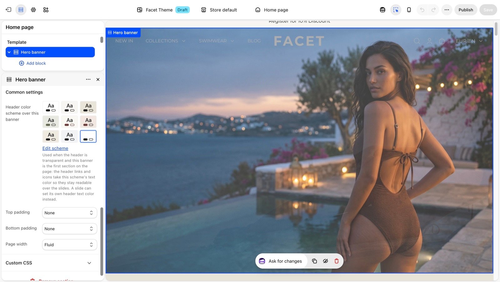
Settings
Color scheme
Picks one of the color schemes you set up in Colors. The scheme colors the section’s background, text, buttons, borders and form fields. The background always runs the full width of the screen, whatever the Page width. Some sections have extra scheme settings in this group, such as a Card color scheme. Those color only the part they name.Top padding and Bottom padding
The space above and below the section’s content, inside its background. Pick the same size on both to center the content in its band.
Phone sizes apply on screens narrower than 750 pixels. The default differs from section to section.
Page width
How wide the section’s content runs. The widths below use the default Layout settings: a Narrow page width of 1440 pixels and a 100 pixel minimum page margin.Narrow
Narrow
A centered column 1024 pixels wide (about 1250 pixels with a Wide page width). Good for text and small groups of cards.
Narrower
Narrower
A centered column about 680 pixels wide (about 830 pixels with a Wide page width). Good for a short message, a form or a single paragraph.
Regular
Regular
The full page width minus the page margin on each side: 1240 pixels.
Fluid
Fluid
The whole width of the screen, with a 50 pixel gap on each side (or your Minimum page margin, if it is smaller).
Full
Full
Edge to edge, with no gap at the sides. Pictures and sliders touch the screen edges. On phones, text in most sections keeps a 20 pixel gap so it doesn’t touch the edge.
Not every section offers every width. A picture-led section such as Image with text offers only Fluid and Full, and the option list in the Theme Customizer shows only what that section supports.
Best practices
- Vary the width for rhythm. Alternating Fluid picture sections with Narrow text sections keeps a long home page from feeling flat.
- Use padding instead of Spacer sections. Padding keeps the space inside the section’s colored band, so it moves with the section when you reorder.
- Reuse a few schemes. Picking from two or three color schemes across the page looks calmer than a different scheme on every section.
Related guides
Layout
Change the page width and margins every section measures from.
Colors
Create the color schemes sections pick from.