

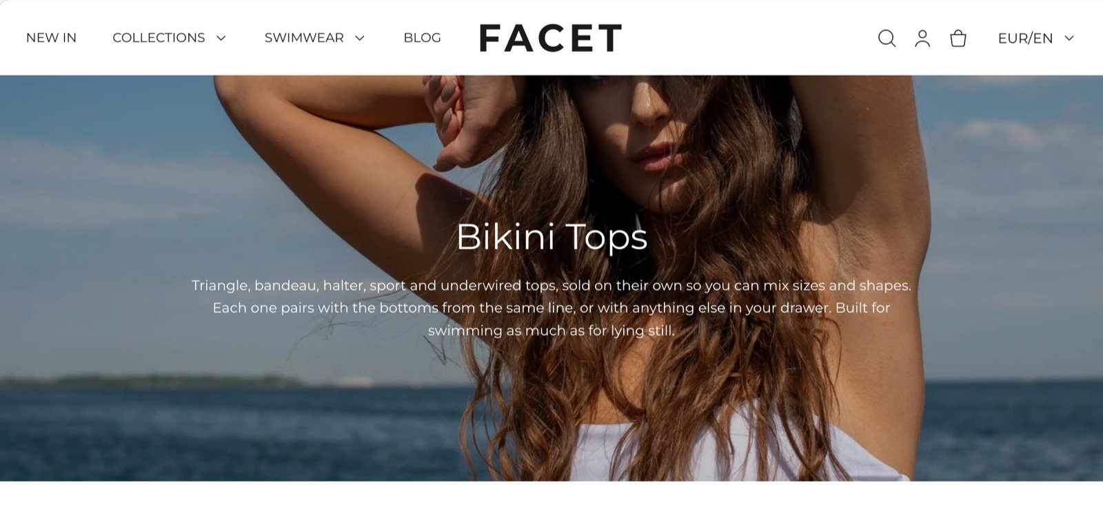
What this section controls
- Whether the page title and description show, or your own text instead.
- The alignment and vertical position of the text.
- A picture above, behind, left or right of the text, with a color overlay.
- The banner height.
- A transparent header over the banner.
The page banner can only be added to these templates: collection, page, blog, article, search and the collection list page. It doesn’t appear in the Add section menu on other templates, such as the home page or product pages.
Getting started
1
Open the Theme Customizer
In your Shopify admin, open Online Store, then Themes, and click Customize next to Facet.
2
Open a supported template
Use the page selector at the top of the editor to open a collection, page, blog, article, search or collection list template. The collection template already includes a page banner.
3
Add or select the section
In the Sections panel, click Page banner, or click Add section and choose Page banner.
4
Choose a picture and height
Pick an Image, set Image position, and choose a Banner height.
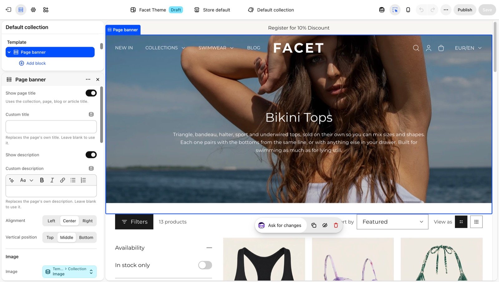
Section settings
Text
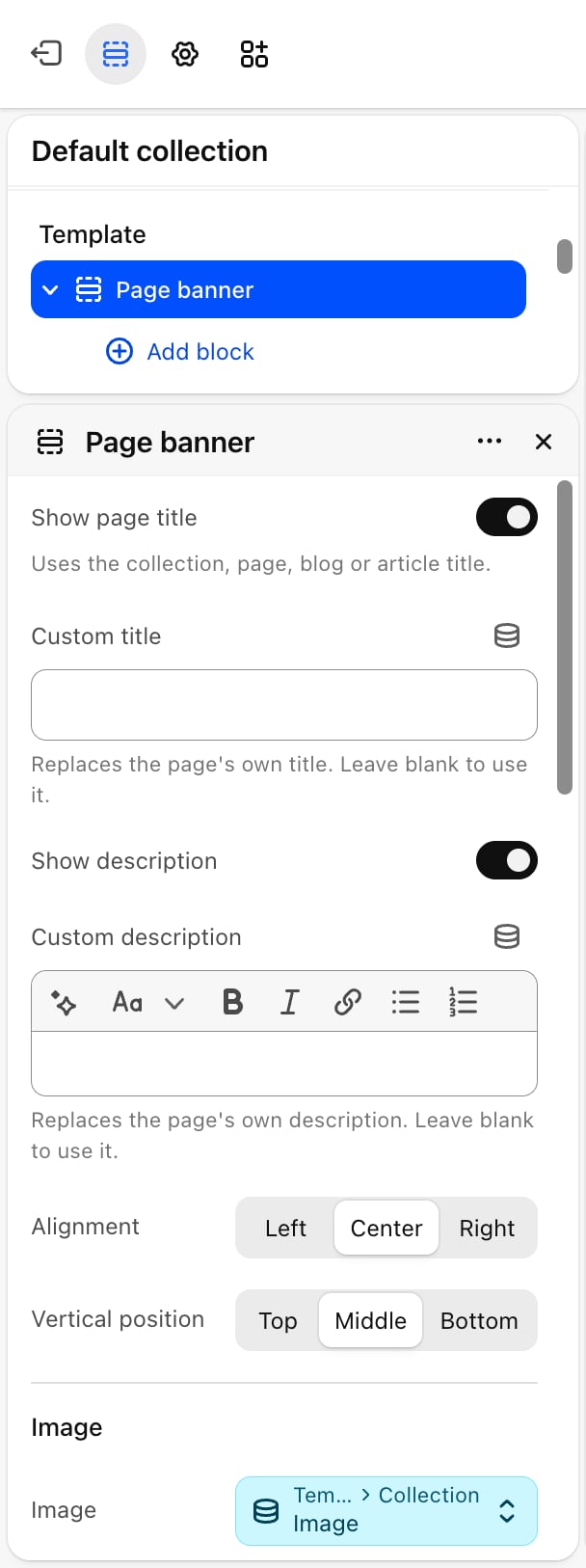
Show page title and Custom title
Show page title and Custom title
Show page title is on by default and shows the title of the page the banner sits on. Custom title replaces it with your own text. Leave it blank to use the page’s title. Custom title appears only when Show page title is on.
Show description and Custom description
Show description and Custom description
Show description is on by default. On a collection, it shows the collection description. On an article, it shows the article’s excerpt, if the article has one. Pages, blogs, search and the collection list have no description to read, so there the banner shows one only when you type a Custom description. Custom description replaces the page’s own description and appears only when Show description is on.
Alignment and Vertical position
Alignment and Vertical position
Alignment: Left, Center (default) or Right. Vertical position: Top, Middle (default) or Bottom. Vertical position matters when the banner is taller than its text, for example with a picture behind it or a tall Banner height.
A Custom title or Custom description shows on every page that uses the template. To give one collection or page its own text, create a separate template for it.
Image
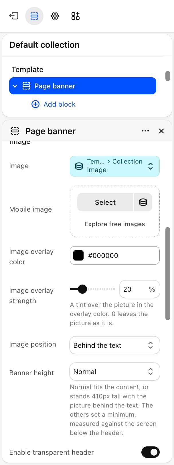
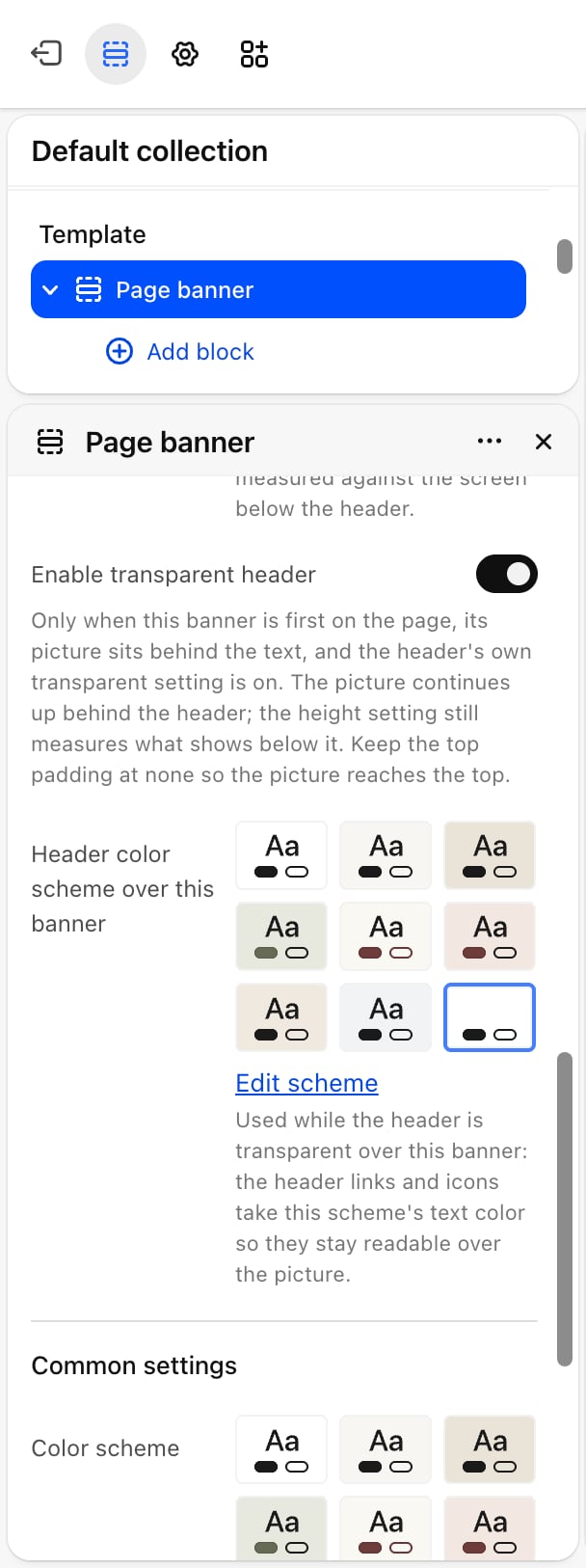
Image and Mobile image
Image and Mobile image
Image is the banner picture. Mobile image is an optional picture for phones. Without one, phones show Image. Without an Image, the banner shows only text, whatever Image position says.
Image overlay color and Image overlay strength
Image overlay color and Image overlay strength
A tint over the picture. Image overlay color: default black. Image overlay strength: from 0 to 90%. Default: 0, which leaves the picture as it is.
Image position
Image position
- Above the text: the picture sits above the title.
- Behind the text (default): the picture fills the banner and the text sits on top.
- Left of the text or Right of the text: on screens 750 pixels wide and larger, the picture sits beside the text.
Enable transparent header
Enable transparent header
Off by default. Lets the banner’s picture continue up behind the header, so the header sits on top of it. This only works when all of these are true:
- The banner is the first section on the page.
- Image position is Behind the text, and an Image is chosen.
- Enable transparent header is on in the header’s own settings.
Common settings
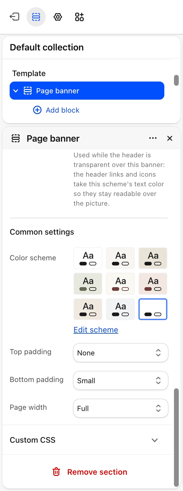
- Color scheme: the colors of the banner and its text.
- Top padding and Bottom padding: None (default), Small, Medium, Large or Extra large.
- Page width: Narrow, Narrower, Fluid or Full (default).
Blocks
Heading, text, button and image
Add Heading, Text, Button and Image blocks under the title and description, for example a button that links to a sale. Their settings are described on Theme blocks.Best practices
- Add an overlay for white text. With the picture behind the text, an Image overlay strength of 20 to 40% keeps a light title readable on any picture.
- Keep collection descriptions short. The full description shows in the banner. Two or three sentences keep the products close to the top of the page.
- Turn on both transparent header settings. The banner’s Enable transparent header does nothing until the header’s own setting is on too.
Related guides
Header
Turn on the header’s transparent setting.
Collection page
Set up the rest of the collection template.