

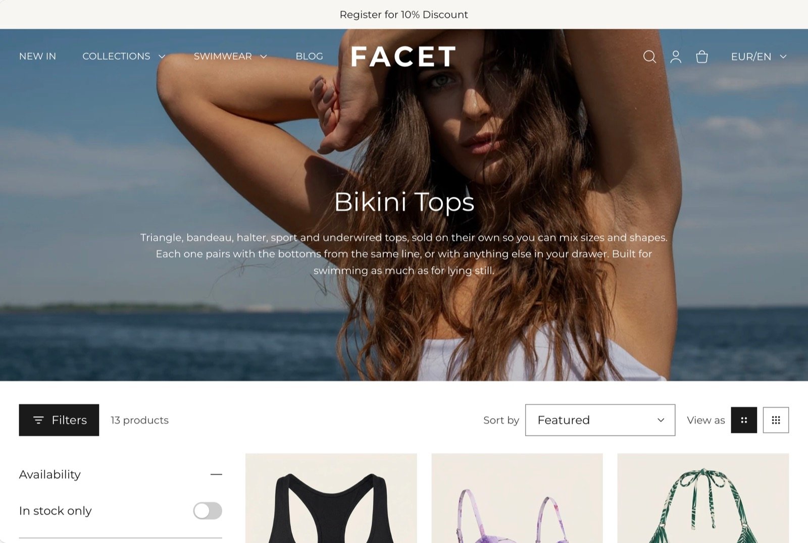
What this section controls
- The collection title, description and product count.
- How many products show per page, and how many columns on large screens.
- Filters in a sidebar or a drawer, and the sort menu.
- The toggle between a larger and a smaller grid.
- Promotional tiles placed among the products.
Getting started
1
Open the Theme Customizer
In your Shopify admin, open Online Store, then Themes, and click Customize next to Facet.
2
Open the collection template
In the template picker at the top of the Theme Customizer, choose Collections, then Default collection.
3
Set up the grid
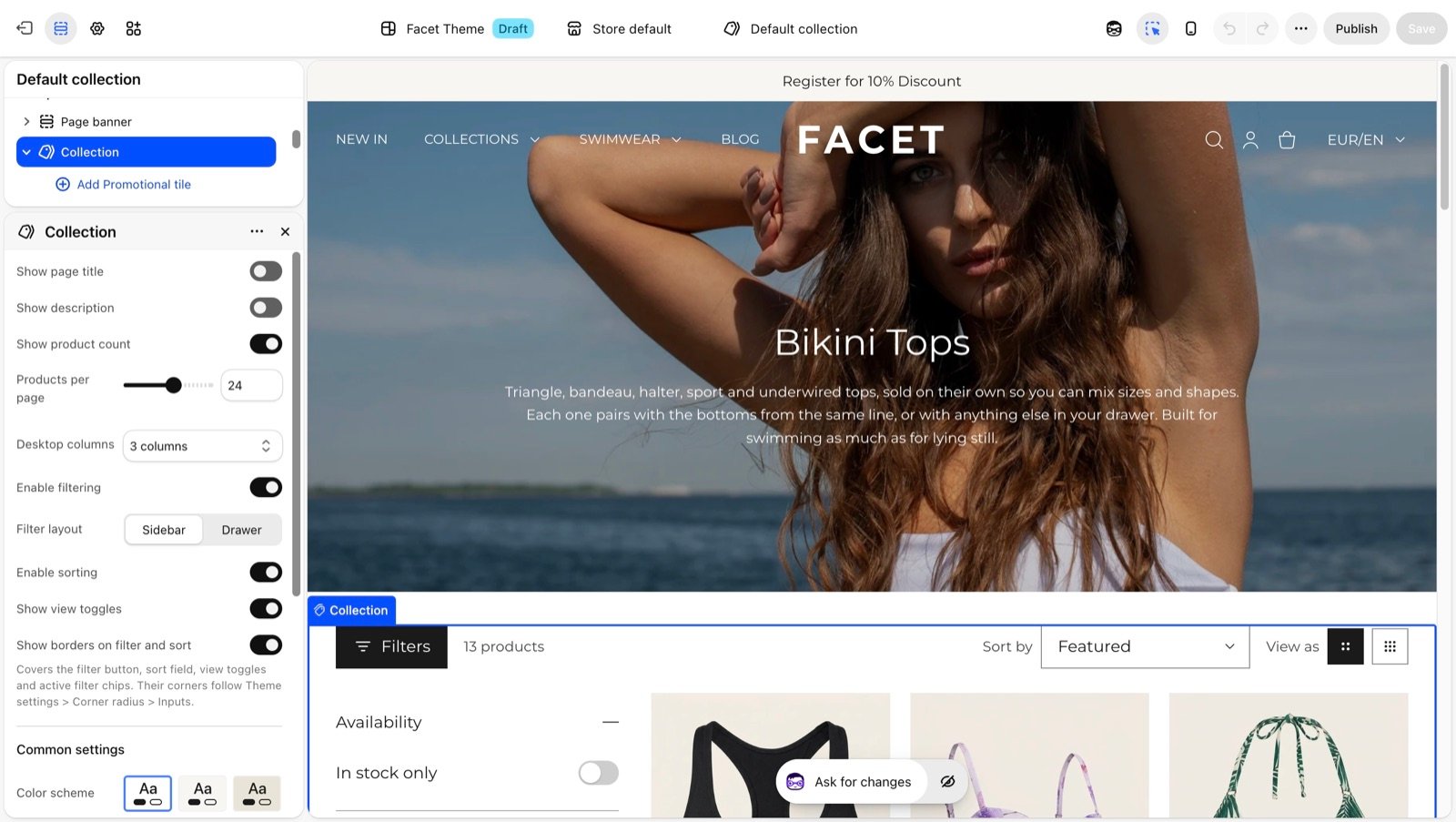
Click Collection in the Sections panel to choose the columns, products per page and filter layout.
4
Add a promotional tile
Under Collection, click Add block, then Promotional tile, and pick the row and column it sits in.
Section settings
Header and grid
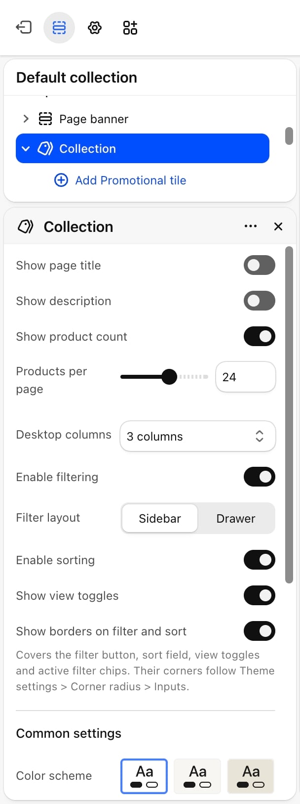
- Show page title: on by default. Shows the collection title above the toolbar.
- Show description: on by default. Shows the collection description under the title, when the collection has one.
- Show product count: on by default. Shows the number of products in the toolbar.
- Products per page: from 8 to 36. Default: 24. When a collection has more products, page numbers appear under the grid.
- Desktop columns: 2 columns, 3 columns (default) or 4 columns. Phones always show 2 columns.
The default collection template opens with a Page banner that already shows the collection title, description and image, so Show page title and Show description are turned off there. Turn them on if you remove the banner.
Filters and sorting
Enable filtering
Enable filtering
On by default. Shows the filters for the collection, such as availability, price, size or color. A Filters button in the toolbar shows how many filters are active, and chips under the toolbar let shoppers remove each one or Clear all.Facet shows availability as one In stock only switch and price as a slider with from and to fields. Color filters show as swatches when you choose swatches for them in Search & Discovery, or when their name is one of your color option names in Variants.
Filter layout
Filter layout
- Sidebar (default): filters sit in a column beside the grid on large screens. Shoppers can fold the column away with the Filters button, and choices apply as soon as they are made.
- Drawer: filters open in a panel from the side. Choices apply when shoppers click Apply.
Enable sorting
Enable sorting
On by default. Shows a Sort by menu with Shopify’s sort options, such as best selling, price and date.
Show view toggles
Show view toggles
On by default. Shows two buttons that switch between larger and smaller product cards. The smaller view adds one column, up to 5. The shopper’s choice is remembered in their browser.
Show borders on filter and sort
Show borders on filter and sort
On by default. Draws borders around the Filters button, the sort menu, the view toggles and the active filter chips. Their corners follow the inputs setting in Corner radius.
The filters themselves come from Shopify’s free Search & Discovery app. Install it, then open the app’s Filters page to choose which filters show and in which order. If no filters are set up, the Filters button is hidden.
Common settings
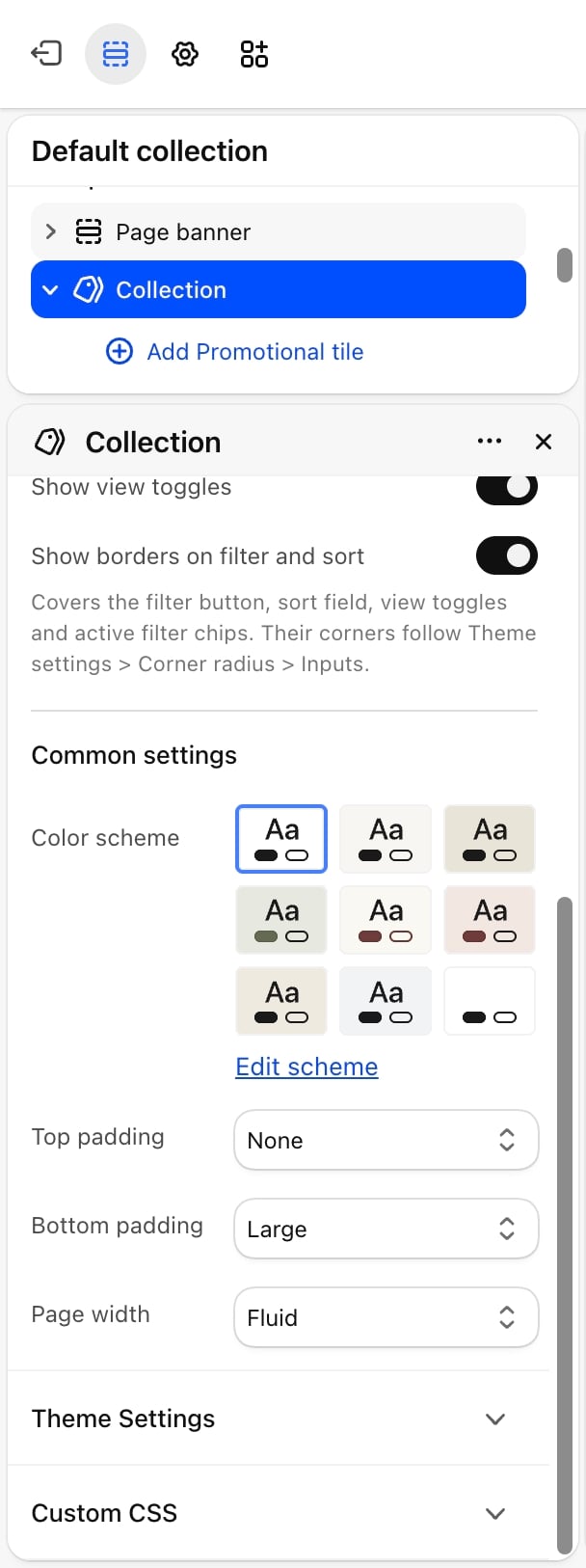
- Color scheme: the colors of the section.
- Top padding: None (default), Small, Medium, Large or Extra large.
- Bottom padding: None, Small, Medium, Large (default) or Extra large.
- Page width: Narrow, Narrower, Fluid (default) or Full.
Blocks
Promotional tile
A tile that takes the place of one product card in the grid, with a picture, a heading, text and a button. The products flow around it. You can add several tiles. Tiles show on the first page of the collection only.- Content
- Position
- Colors
- Image: a picture that fills the tile, behind the text. Without one, the tile shows its color scheme.
- Heading: default “Thoughtful luxury”.
- Text: default “Elevated wardrobe staples, made responsibly.”
- Button label: default “Shop now”. Leave it blank to hide the button.
- Link: where the button goes.
Other sections on the collection template
The default collection template comes with these sections, in this order. Each one can be edited, hidden, removed or reordered.- Page banner: the collection title, description and image, above the grid.
- Collection: the section on this page.
- FAQ: common questions and answers.
- Promotion banner: a promotion with a countdown and a button.
- Testimonials: customer quotes.
Best practices
- Set up filters in Search & Discovery first. Without filters in the app, shoppers only get sorting.
- Pick a calm tile picture. The tile text sits directly on the picture, so a picture with a plain area keeps it readable.
- Keep tiles below the first row. Placing a promotional tile on row 3 or later lets shoppers see products first.
- Match columns to your photos. Tall product photos read well at 3 columns. Use 4 columns for small items or large catalogs.
Related guides
Product cards
Change how product cards in the grid look.
Collection list page
Show all your collections on one page.