


What this section controls
- A stacked layout, or a side by side layout with the text beside the logos.
- How many logos sit in each row, and lines between them.
- Each logo’s picture, height and link.
Getting started
1
Open the Theme Customizer
In your Shopify admin, open Online Store, then Themes, and click Customize next to Facet.
2
Add the section
In the Sections panel, click Add section and choose Logo list. The section can’t be added to the header.
3
Add your logos
Open the Logos block and click each Logo block to choose its Image. Click Add block inside Logos, then Logo, to add more.
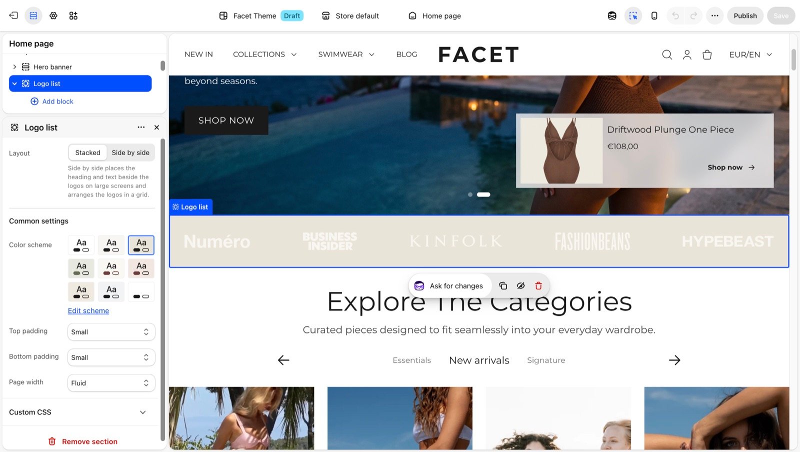
Section settings
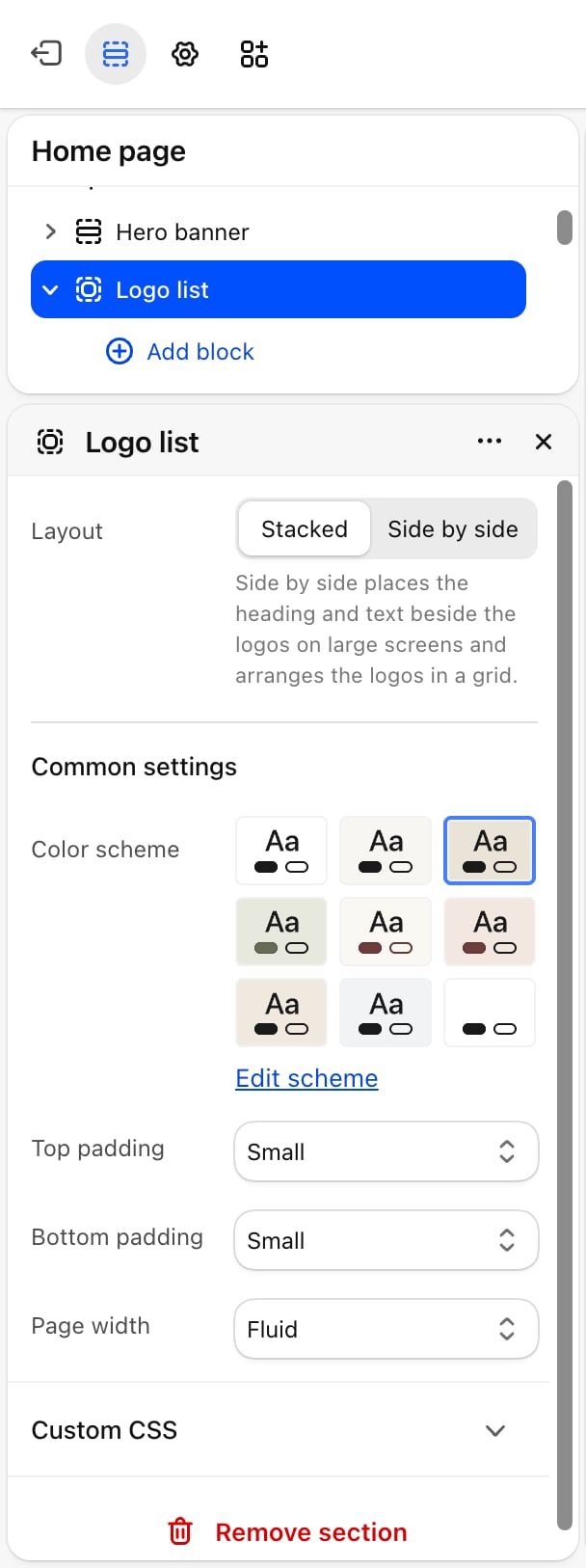
Layout
Layout
Layout
- Stacked (default): the heading and text sit above the logos. The Logos block’s own Layout setting decides how the logos are arranged.
- Side by side: on screens 990 pixels wide and larger, the heading and text sit on the left and the logos on the right, arranged in a grid. On smaller screens the text sits above the logos.
Logos per row
Logos per row
From 2 to 6. Default: 2. The number of logos in each grid row on screens 750 pixels wide and larger. Phones show 2 per row. Appears only when Layout is Side by side.
Show dividers
Show dividers
Off by default. Draws a thin line between the logos, in the color scheme’s border color. The lines are hidden on phones. Appears only when Layout is Side by side.
Common settings
See Common settings for details.- Color scheme: the colors of the section.
- Top padding and Bottom padding: None, Small (default), Medium, Large or Extra large.
- Page width: Narrow, Narrower, Fluid (default) or Full.
Blocks
Heading and text
Add Heading and Text blocks to introduce the logos. Their settings are described on Theme blocks.Logos
The Logos block holds the logos.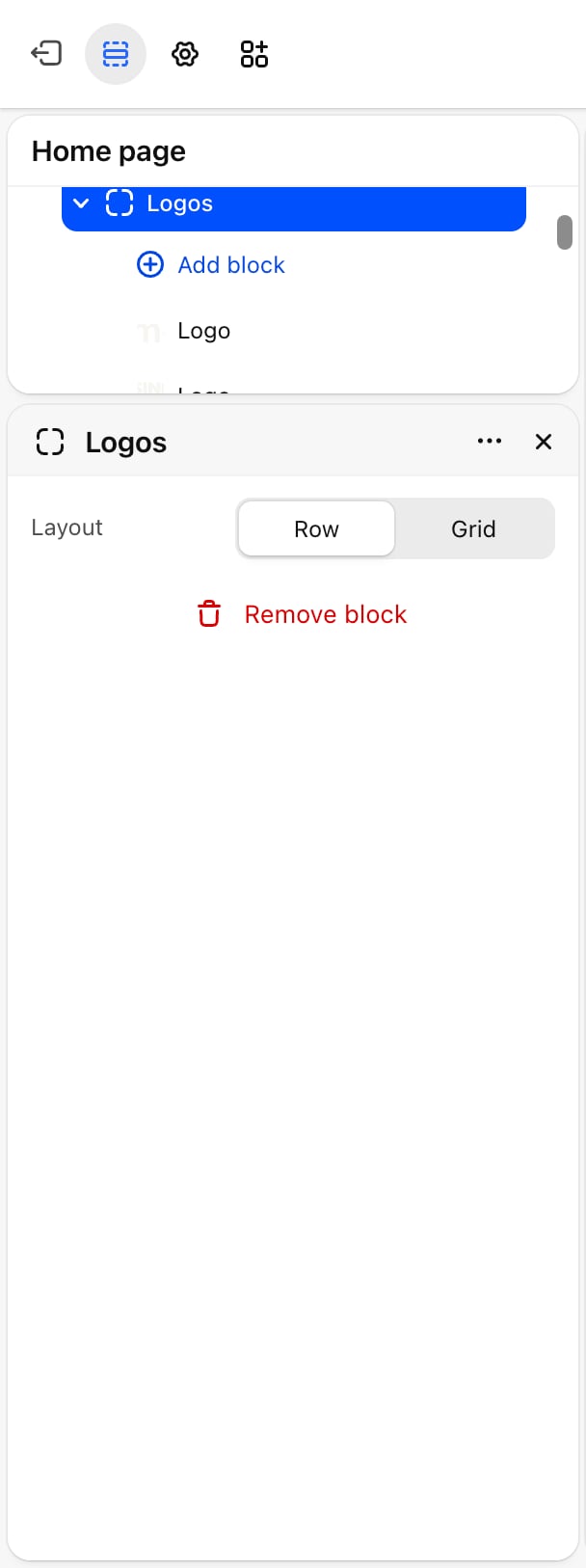
- Layout: Row (default) or Grid. Row spreads the logos across one line. When they don’t fit, shoppers scroll the row sideways. Grid places them two per row.
With the section’s Layout set to Side by side, the logos always form a grid sized by Logos per row, and the block’s own Layout has no effect. Keep the Logos block last in the section, below the heading and text, so the side by side layout can place it on the right.
Logo
Each Logo block inside Logos is one logo.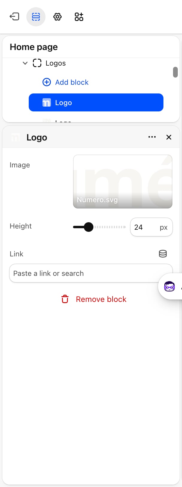
- Image: the logo picture. Until you choose one, a placeholder shows.
- Height: from 12 to 60 pixels. Default: 24. The logo keeps its own shape.
- Link: optional. Makes the logo a link, for example to the article that mentions you.
Best practices
- Use transparent logos. PNG or SVG files without a background sit cleanly on any color scheme.
- Match visual weight, not height. A wide wordmark at 24 pixels can look larger than a square badge at 24 pixels. Adjust Height per logo until they look balanced.
- Use one color. Logos in a single color, such as all black or all white, look calmer than full-color brand marks.
Related guides
Theme blocks
Settings for the heading and text blocks.
Testimonials
Pair press logos with quotes from your customers.