

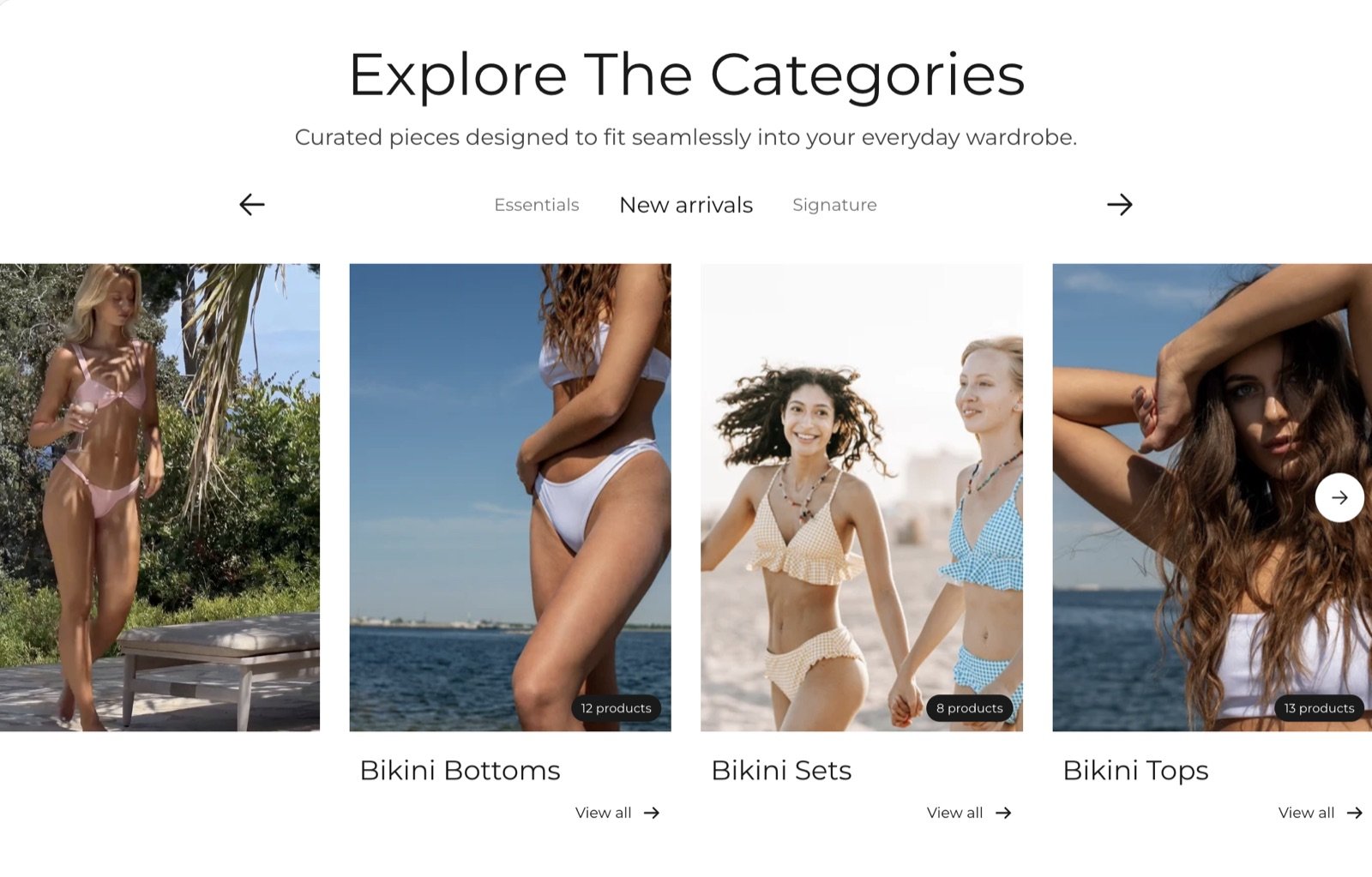
What this section controls
- An optional heading and text above the tabs.
- The tabs, one per collection set.
- The collection cards in each tab, with an optional lead picture or video.
- Whether cards show the collection description and product count.
Getting started
1
Open the Theme Customizer
In your Shopify admin, open Online Store, then Themes, and click Customize next to Facet.
2
Add the section
In the Sections panel, click Add section and choose Tabbed collections. It starts with two tabs, “New arrivals” and “Bestsellers”, holding empty collection cards. It can’t be added to the header or footer.
3
Pick your collections
Expand a Collection set, click each Collection card and choose a collection.
4
Name the tabs
Click each Collection set and change its Label. The label is the tab name.
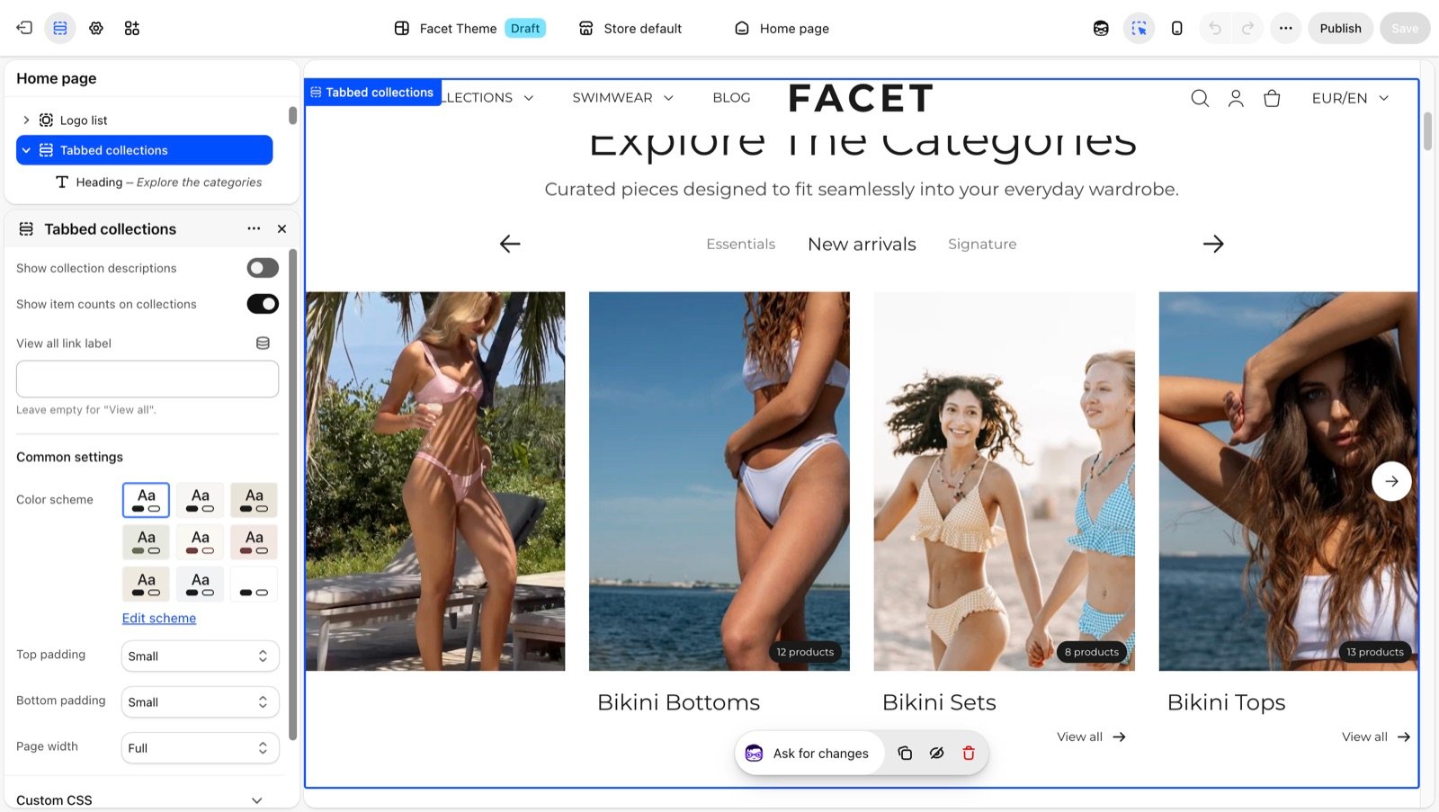
Section settings
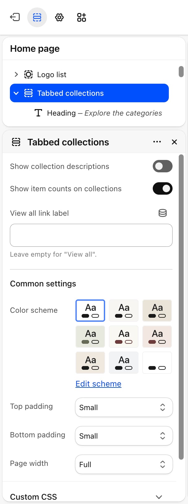
- Show collection descriptions: on by default. Shows a short description under each card title.
- Show item counts on collections: on by default. Shows the number of products in a badge on each card picture.
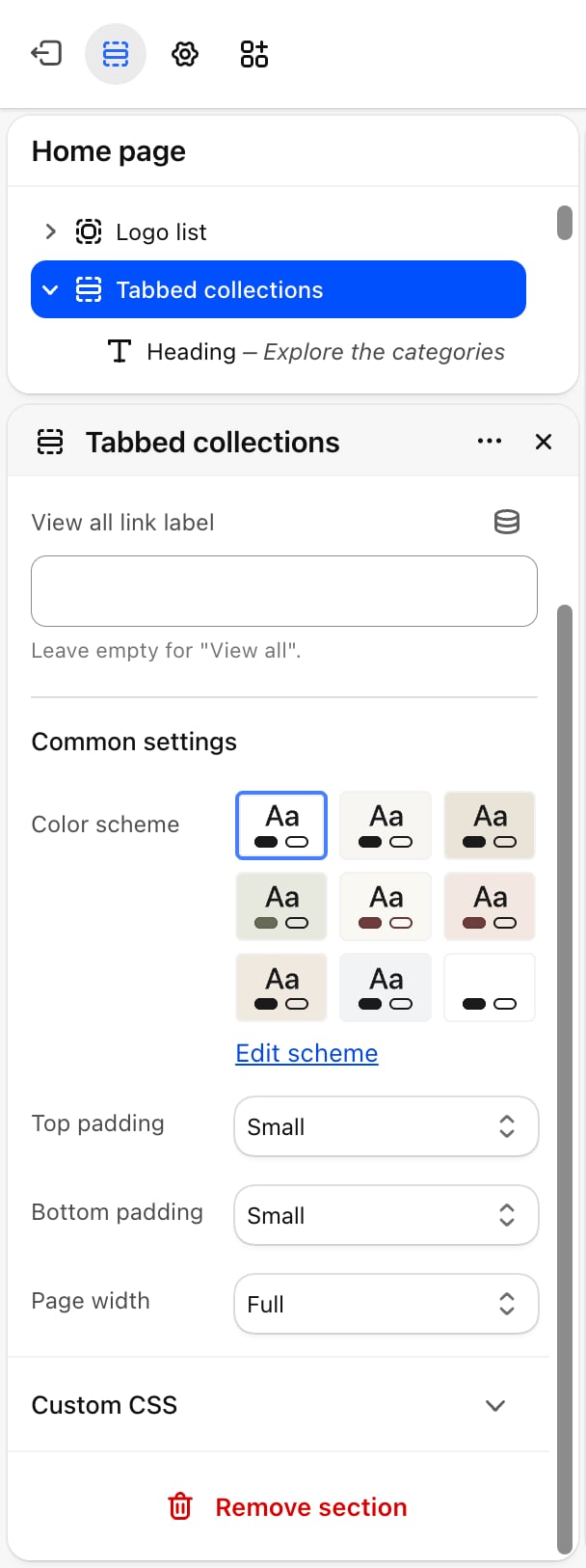
- View all link label: the link text under each card. Leave it empty for “View all”.
Common settings
- Color scheme: the colors of the section.
- Top padding and Bottom padding: None, Small, Medium, Large (default) or Extra large.
- Page width: Narrow, Narrower, Fluid (default) or Full.
Blocks
Heading and text
The section has a fixed Heading and Text above the tabs. Empty both to hide them. See Theme blocks for their settings.Collection set
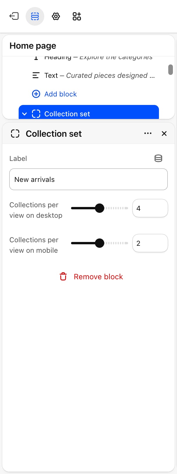
- Label: the tab name. Default: “New arrivals”.
- Collections per view on desktop: from 2 to 6. Default: 4.
- Collections per view on mobile: from 1 to 3. Default: 2.
Collection card
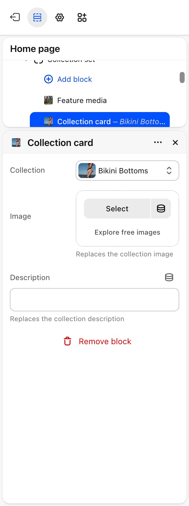
- Collection: picked with the collection picker. The card shows the collection’s picture, title, description, product count and a link. Until you pick one, the card shows a placeholder picture and the title “Collection”, with no link or count.
- Image: replaces the collection image. Without one, the card uses the collection’s image, then the picture of its first product.
- Description: replaces the collection description. Without one, the card shows the start of the collection’s own description, up to 60 characters.
Feature media
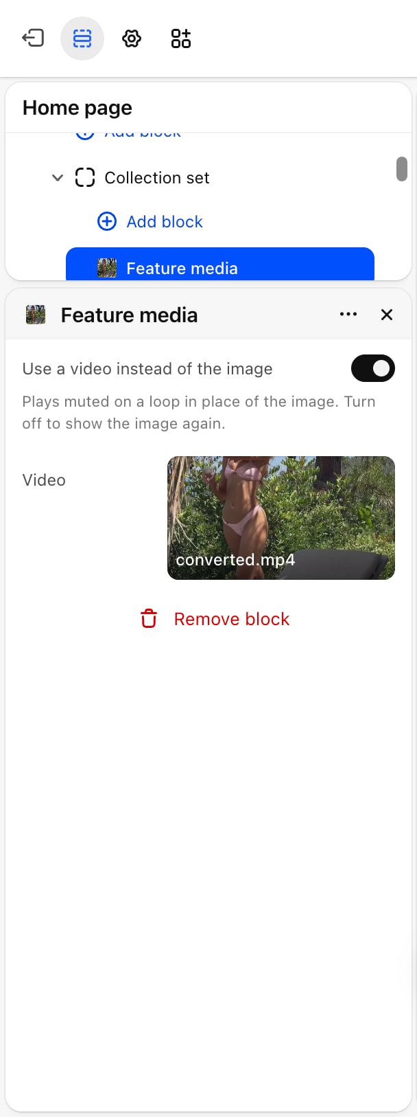
- Use a video instead of the image: off by default. Plays a video muted on a loop in place of the image. Turn it off to show the image again.
- Image: appears only when the video is off. A placeholder shows until you pick one.
- Video: appears only when the video is on.
Best practices
- Keep tab labels short. One or two words, such as “Swim” or “Beachwear”, keep the tab row tidy.
- Fill every card. An empty card shows a placeholder in your store. Delete cards you don’t need.
- Use the same number of cards in each tab. Rows of equal length make switching tabs feel steady.
- Write short card descriptions. Collection descriptions are cut at 60 characters. Use the card’s Description field for a line written for this section.
Related guides
Collection highlights
Show collections without tabs.
Featured collection
Show the products of one collection.