

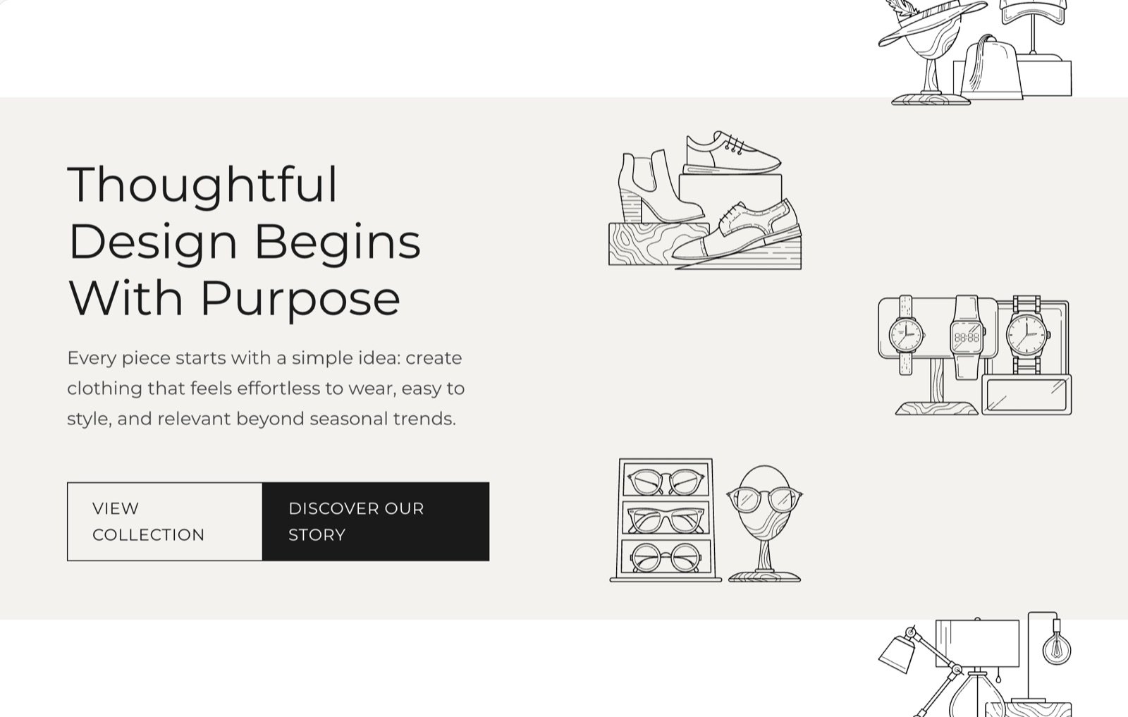
What this section controls
- The five pictures in the gallery.
- How far the picture columns move while the page scrolls.
- The heading, text and buttons beside the gallery.
Getting started
1
Open the Theme Customizer
In your Shopify admin, open Online Store, then Themes, and click Customize next to Facet.
2
Add the section
In the Sections panel, click Add section and choose Call to action. The section can’t be added to the header or footer.
3
Pick the pictures
Click Call to action and choose Image 1 to Image 5.
4
Write the message
Edit the heading, text and button blocks, and set each button’s link.
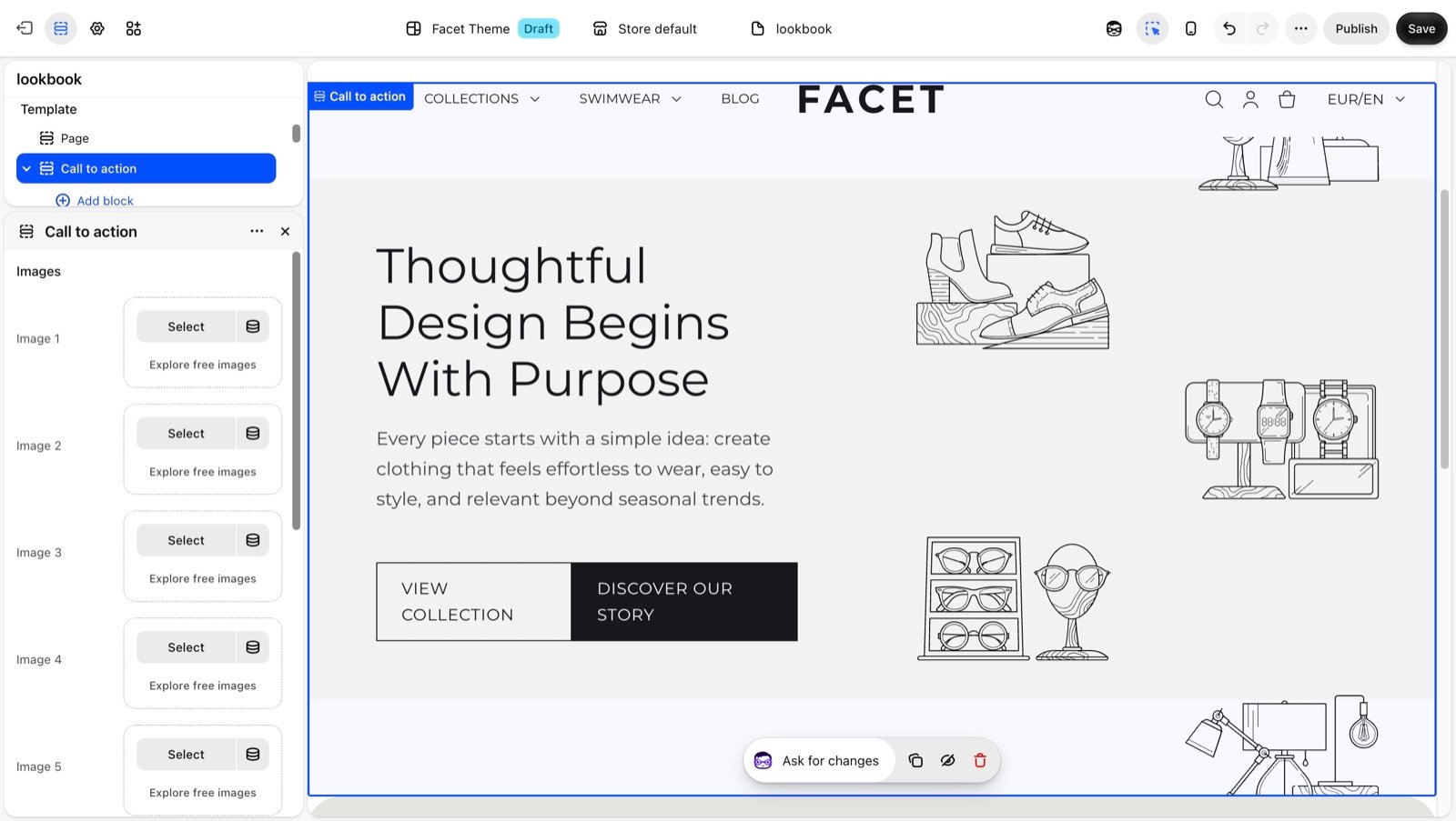
Section settings
Images
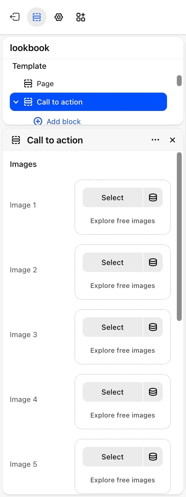
- Image 1 and Image 2: the pictures in the left column of the gallery.
- Image 3, Image 4 and Image 5: the pictures in the right column.
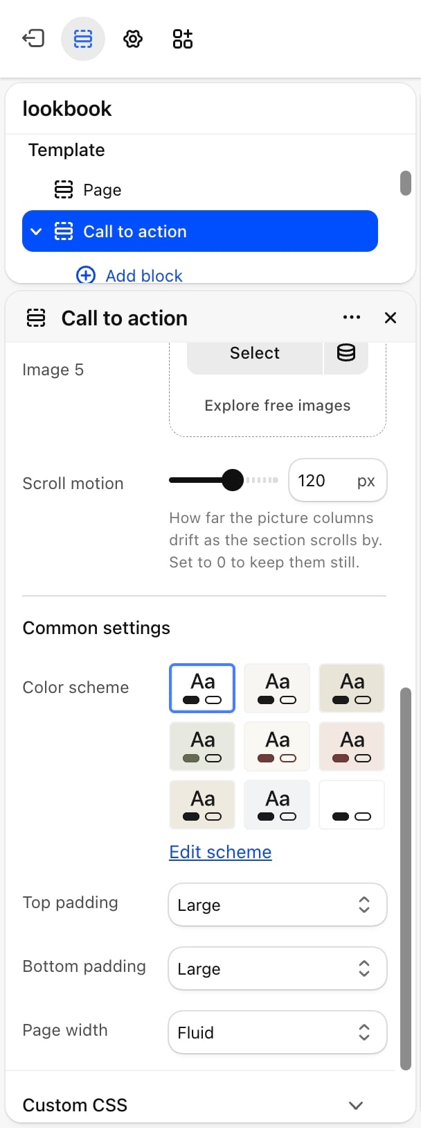
- Scroll motion: how far the picture columns drift as the section scrolls by, from 0 to 200 pixels. Default: 120. Set it to 0 to keep the columns still.
The scroll motion runs on screens 990 pixels wide and larger. On smaller screens, and for shoppers who have turned on reduced motion on their device, the columns stay still. The pictures are decorative, so screen readers skip them: put anything important in the text.
Common settings
See Common settings for details.- Color scheme: the colors of the section.
- Top padding and Bottom padding: None, Small, Medium, Large (default) or Extra large.
- Page width: Narrow, Narrower, Fluid (default) or Full.
Blocks
Heading, text, button and group
The message beside the gallery is built from Heading, Text, Button and Group blocks. Use a Group to place several buttons side by side. Their settings are described on Theme blocks. On large screens the blocks sit to the left of the gallery. On phones they sit above it.Best practices
- Fill all five pictures. Empty slots show placeholders on your live store.
- Use pictures with a centered subject. The gallery crops every picture to the same upright shape.
- Lower the scroll motion for busy pages. A value around 60 pixels feels calmer when the section sits near other moving content.
Related guides
Theme blocks
Settings for the heading, text, button and group blocks.
Animations
Control the other motion effects in your store.