

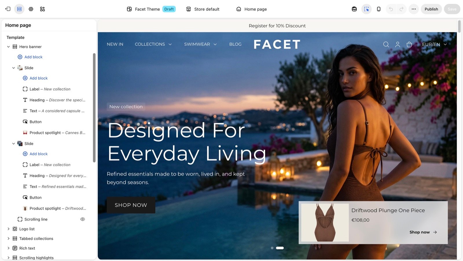
What blocks control
- Which pieces of content a section shows, and in what order.
- The text, size, width and alignment of each piece.
- How pieces sit together, in a column or a row, when you put them in a Group.
Getting started
1
Open the Theme Customizer
In your Shopify admin, open Online Store, then Themes, and click Customize next to Facet.
2
Expand a section
In the Sections panel, click the arrow next to a section to see its blocks.
3
Add a block
Click Add block under the section, or under a block that holds other blocks, and pick a block from the list. The list shows only the blocks that section accepts.
4
Edit the block
Click the block to open its settings.
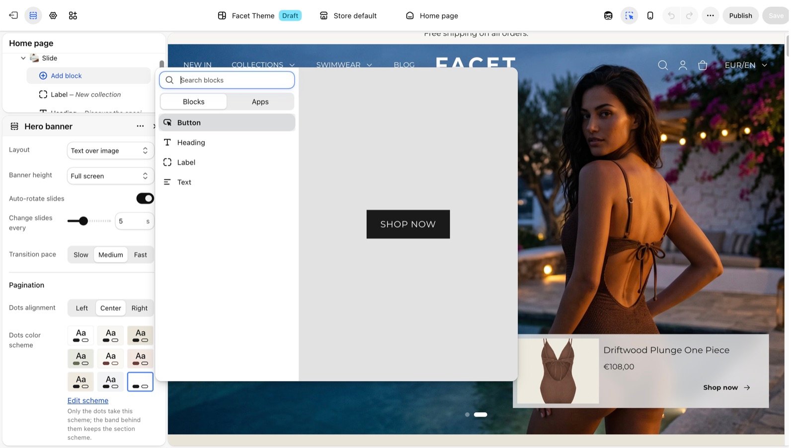
Manage blocks
- Reorder: drag a block by its handle (the dotted icon on its left) to a new place in the list. You can also drag a block into or out of a Group.
- Hide: hover over a block and click the eye icon. The block stays in the list but shoppers don’t see it. Click the icon again to show it.
- Remove: click the block, then click Remove block at the bottom of its settings.
- Nest: some blocks hold other blocks, such as a hero banner Slide or a Group. Expand them with their arrow to add or edit the blocks inside.
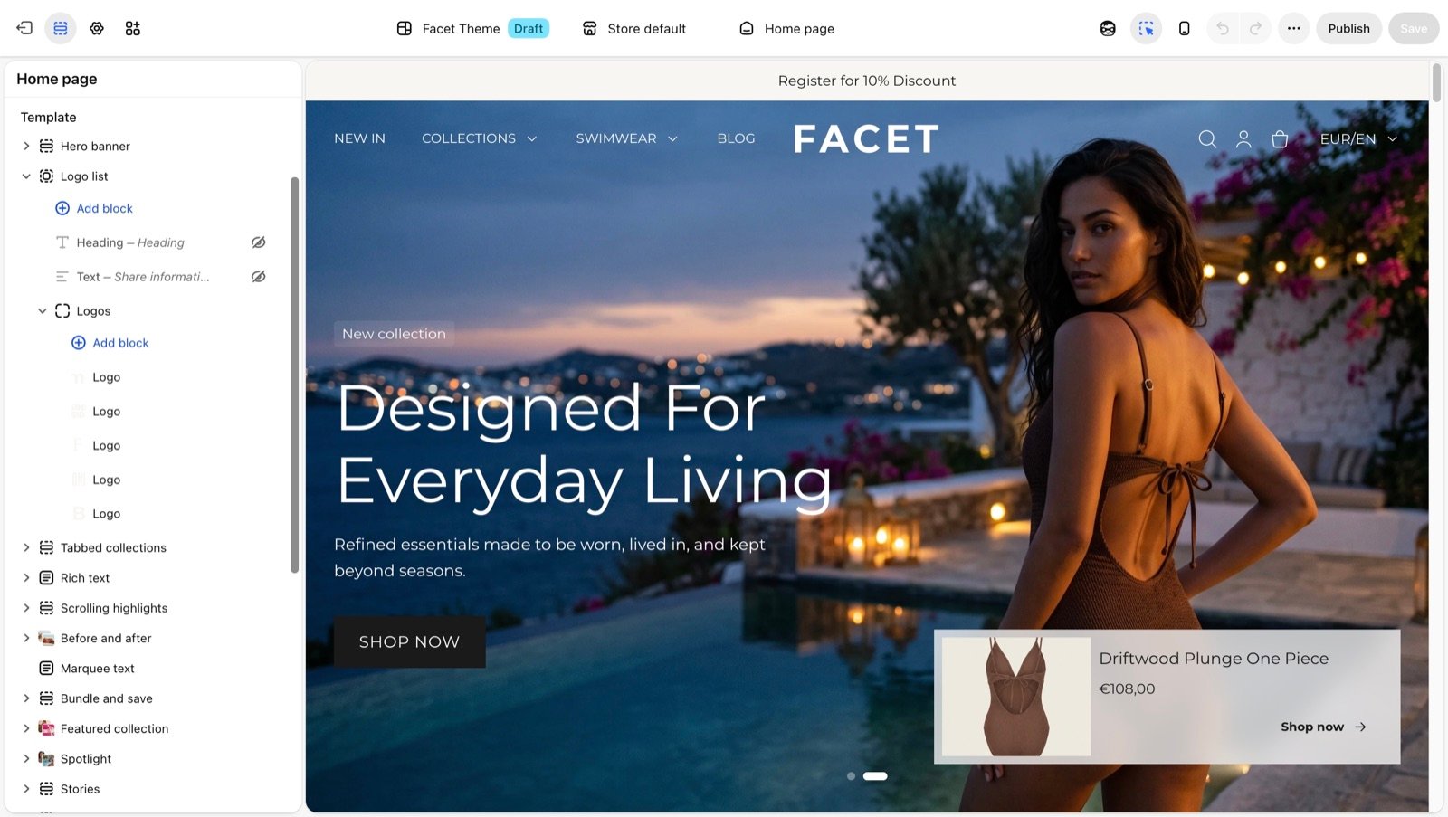
Many blocks only make sense in one section, such as Slide in the hero banner, Mosaic tile in the mosaic or Testimonial in the testimonials section. Those are documented on their section pages. This page covers the shared blocks.
Shared blocks
Heading
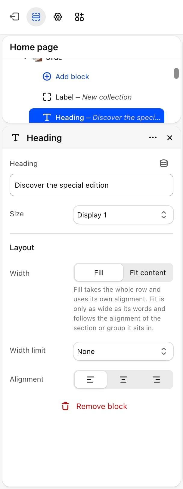
- Heading: the text. Default: “Heading”.
- Size: Display 1, Display 2, Heading 1, Heading 2 (default), Heading 3, Heading 4 or Heading 5. See the pixel sizes in Typography.
- Width: Fill (default) takes the whole row and uses its own Alignment. Fit content is only as wide as its words and follows the alignment of the section or group it sits in.
- Width limit: None (default), Medium (about 36 characters per line) or Narrow (about 24 characters per line). Keeps long headings from running across the whole section.
- Alignment: Left (default), Center or Right. Appears only when Width is Fill.
Text
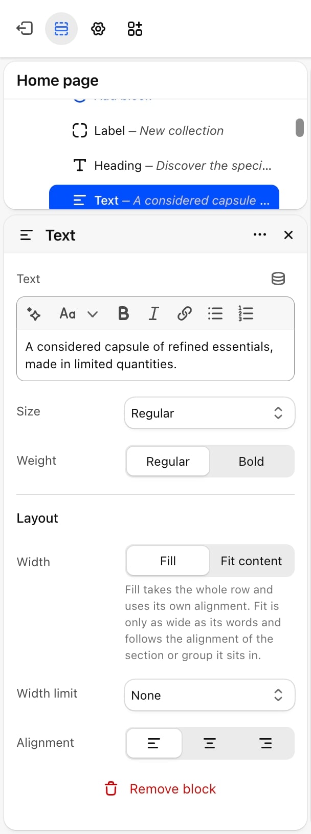
- Text: the text, with bold, italic and links.
- Size: Display 2, Heading 1, Heading 2, Heading 3, Heading 4, Heading 5, Large, Regular (default), Small or Caption. The large sizes make body text bigger without turning it into a heading.
- Weight: Regular (default) or Bold.
- Width: Fill (default) or Fit content, as for the Heading block.
- Width limit: None (default), Medium (about 60 characters per line) or Narrow (about 40 characters per line).
- Alignment: Left (default), Center or Right. Appears only when Width is Fill.
Button
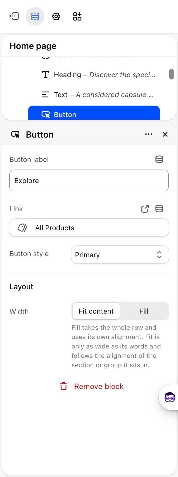
- Button label: the text on the button. Default: “Shop now”.
- Link: where the button goes. Without a link the button doesn’t show on your store. In the Theme Customizer it stays visible so you can still select it and add a link.
- Button style: Primary (default) is filled with the scheme’s button colors. Secondary is outlined in the scheme’s Secondary button label color and fills on hover. Tertiary is filled with the scheme’s Accent color.
- Width: Fit content (default) is only as wide as its label and follows the alignment of the section or group. Fill takes the whole row and uses its own Alignment.
- Alignment: Left (default), Center or Right. Appears only when Width is Fill.
Image
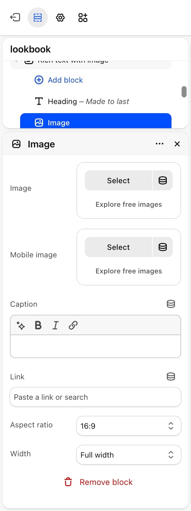
- Image: the picture. Until you pick one, a placeholder illustration shows.
- Mobile image: an optional picture for phones. Without one, phones show Image.
- Caption: short text under the picture, in a small muted size.
- Link: makes the picture clickable.
- Aspect ratio: Natural (default) keeps the picture’s own shape. 1:1, 4:3, 16:9, 21:9 and 3:4 crop it to that shape.
- Width: Full width (default), Wide (80% of the section), Medium (60%) or Small (40%). On phones every width fills the section.
- Alignment: Left, Center (default) or Right. Appears only when Width is not Full width.
Label
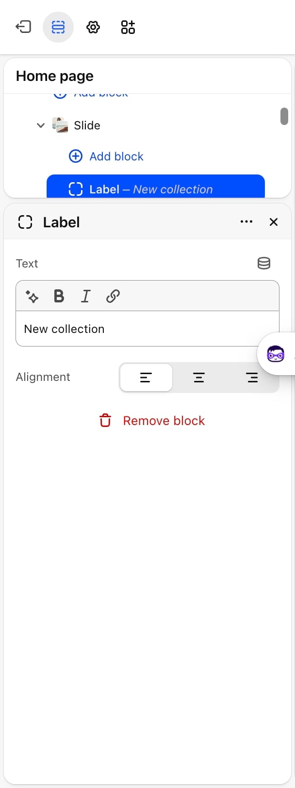
- Text: the label text. Default: “New collection”.
- Alignment: Left (default), Center or Right.
Group
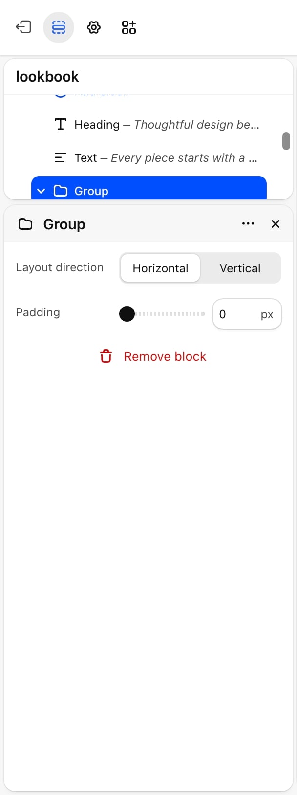
- Layout direction: Horizontal places the blocks side by side, spread across the row from one end to the other and centered on each other. Vertical (default) stacks them.
- Alignment: Left (default), Center or Right. Lines up the stacked blocks and their text. Appears only when Layout direction is Vertical.
- Padding: from 0 to 200 pixels. Default: 0. Adds space above and below a vertical group, or left and right of a horizontal one.
Custom Liquid
A place for app snippets or your own Liquid and HTML inside a section.- Liquid code: the code to render.
Best practices
- Use Fit content for side-by-side buttons. Two Fit content buttons in a Row group sit next to each other. Fill buttons each take a row.
- Set a width limit on long text. Medium keeps paragraphs at a comfortable line length in wide sections.
- Hide instead of remove. Hide a seasonal block to keep its settings for next time.
- Keep one Display heading per page. Big headings work best when only the first section uses them.
Related guides
Common settings
Set each section’s colors, padding and width.
Custom section
Build a section from any theme blocks.