

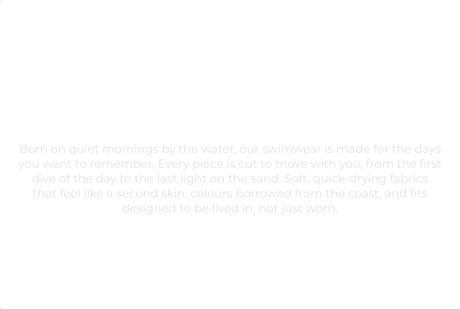
What this section controls
- The blocks in the column and their order.
- A reveal effect that colors the words in as shoppers scroll.
- The column width, colors and spacing.
Getting started
1
Open the Theme Customizer
In your Shopify admin, open Online Store, then Themes, and click Customize next to Facet.
2
Add the section
In the Sections panel, click Add section and choose Rich text or Rich text with image. It can’t be added to the header or footer.
3
Write your content
Click each block to change its wording. Click Add block to add a heading, text, image or button.
Presets
The section comes in two versions in the Add section menu. Both are the same section with different starting blocks, so you can turn one into the other by adding or removing blocks.- Rich text: a large centered heading (“Thoughtful materials”) over a centered paragraph in a larger text size.
- Rich text with image: a left-aligned heading (“Made to last”), then a full-width 16:9 image, then a left-aligned paragraph.
Section settings
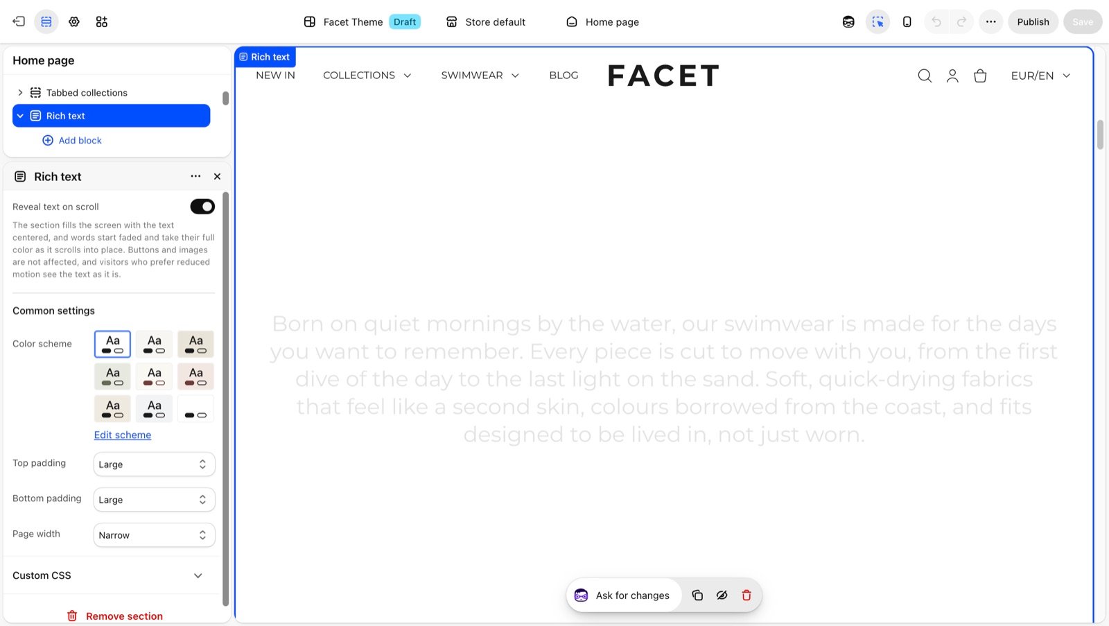
Reveal text on scroll
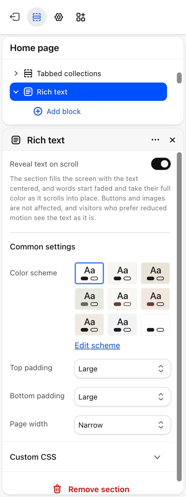
Reveal text on scroll
Off by default. When on, the section fills the screen and centers its content. Every word starts faded and takes its full color as the text scrolls into place, a few words at a time.Buttons and images are not affected. Shoppers who ask their device to reduce motion see the text as it is, without the effect.
Common settings
- Color scheme: the colors of the section.
- Top padding: None, Small, Medium (default), Large or Extra large.
- Bottom padding: None, Small, Medium, Large (default) or Extra large.
- Page width: Narrow (default), Narrower, Regular, Fluid or Full. This section also offers Regular, between Narrower and Fluid.
Blocks
Rich text accepts Heading, Text, Image and Button blocks. Add as many as you need and drag them to change their order. See Theme blocks for their settings.Best practices
- Keep the reveal for short text. The effect works best on one or two sentences in a large size. Long paragraphs take a lot of scrolling to finish.
- Use one reveal section per page. Each one fills the screen, so several in a row slow shoppers down.
- Keep the narrow width for reading. Lines of text are easier to read in the Narrow or Narrower width. Use wider widths when the section holds an image.
Related guides
Theme blocks
Settings for the heading, text, image and button blocks.
Statement
Mix large words and small pictures in one line.