

What these settings control
- The shape of the product picture on every card.
- The alignment of the title, price and color swatches under the picture.
- An optional thin border around each card.
How to access
1
Open the Theme Customizer
In your Shopify admin, open Online Store, then Themes, and click Customize next to Facet.
2
Open Theme settings
Click the Theme settings icon in the left sidebar.
3
Open Product cards
Expand Product cards. Open a collection page in the preview to see every change.
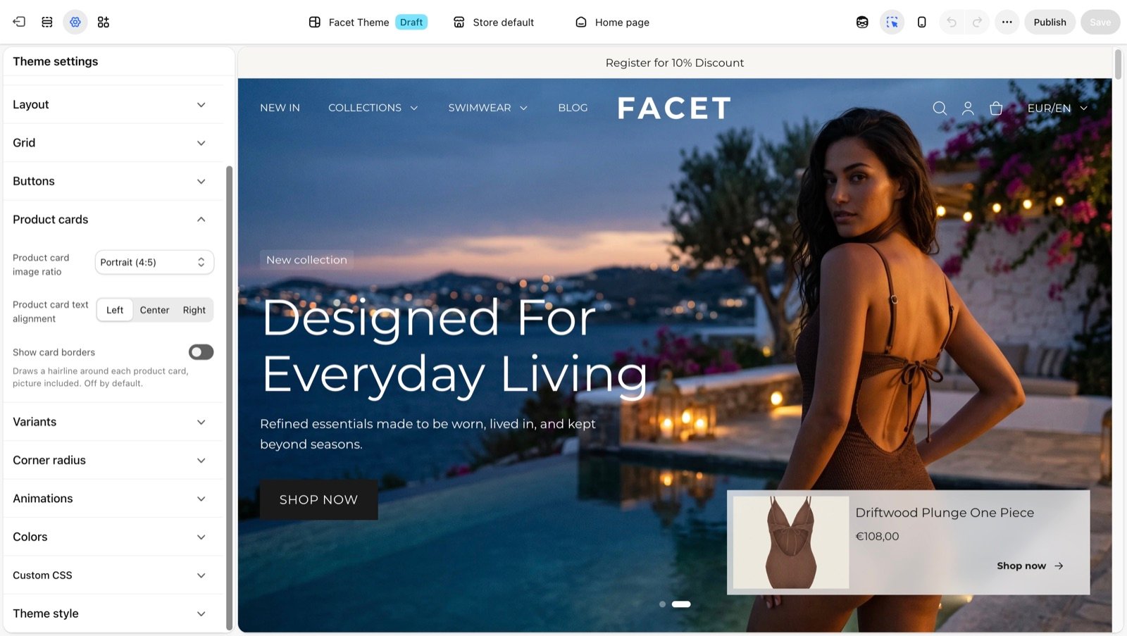
Product card settings
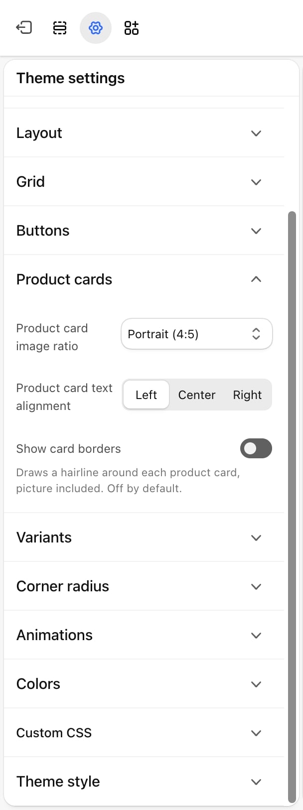
Product card image ratio
Product card image ratio
The shape of the picture area. Pictures are cropped to fill it.
- Adapt to image: no fixed shape. The picture area stretches with the card.
- Square (1:1) (default)
- Portrait (4:5)
- Portrait (3:4)
- Portrait (2:3)
- Landscape (4:3)
- Landscape (3:2)
Product card text alignment
Product card text alignment
Left (default), Center or Right. Aligns the product title, price and the row of color swatches under the picture.
Show card borders
Show card borders
Off by default. Draws a thin line around each card, picture included, in the Border color of the section’s color scheme. The text under the picture moves in from the edge by 16 pixels so it doesn’t touch the line. The border’s corners follow the Cards setting in Corner radius.
The color swatches on a card come from the Variants settings. A card shows up to four swatches, then a count of the rest, such as “+2”.
Best practices
- Match the ratio to your photos. Pick the ratio your product photos are shot in, so nothing important is cropped. Portrait (4:5) or (3:4) suits clothing on a model.
- Avoid Adapt to image with mixed photos. When photos come in different shapes, a fixed ratio keeps every row of cards level.
- Use borders on busy backgrounds. A border helps cards stand apart when pictures have a background close to the page color.
Related guides
Collection page
Set up the product grid where cards appear.
Variants
Choose which options show as swatches on cards.