


What this section controls
- The menus shown on desktop and in the mobile drawer.
- The mega menu layout and the picture cards inside it.
- The logo position, and an optional SVG logo.
- Whether the header is transparent over a banner, and whether it stays at the top while scrolling.
- The search icon or field, and the popular searches shown before typing.
- The country and language selector.
Getting started
1
Open the Theme Customizer
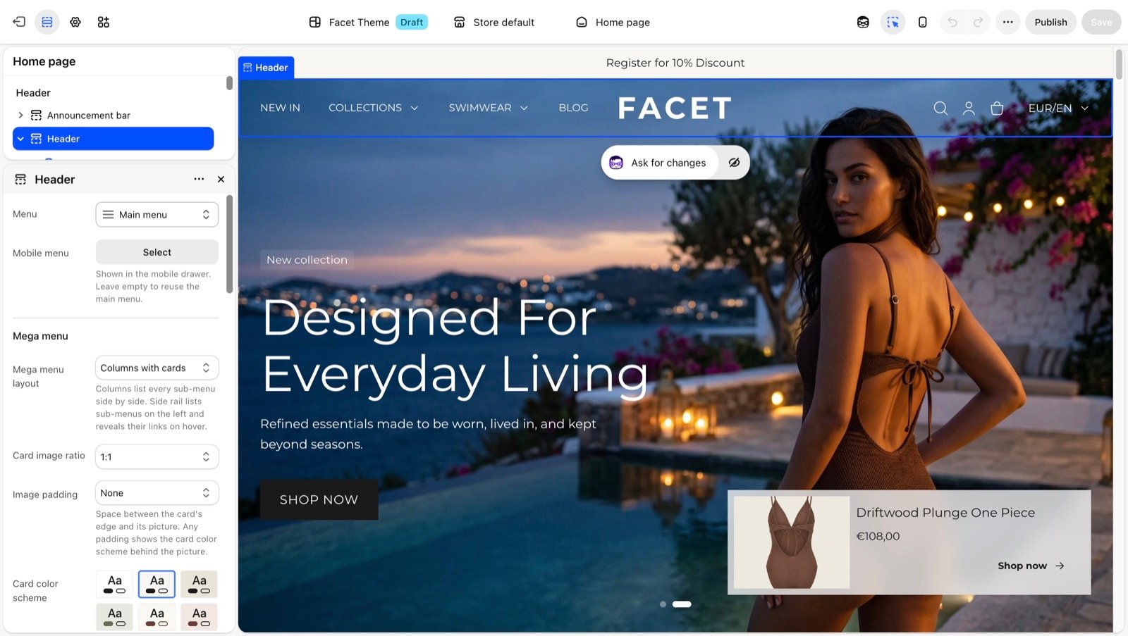
In your Shopify admin, open Online Store, then Themes, and click Customize next to Facet.
2
Select the header
In the Sections panel on the left, click Header in the header group at the top.
3
Choose your menus
Pick the Menu for desktop. Optionally pick a separate Mobile menu.
4
Add menu cards
Under the header, click Add block, then Menu card, to show a picture card inside the mega menu.
Section settings
Menus
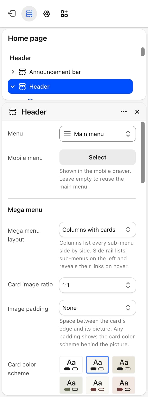
- Menu: the menu shown in the header on desktop. Default: Main menu.
- Mobile menu: the menu shown in the mobile drawer. Leave it empty to reuse the main menu.
Mega menu
Card image ratio
Card image ratio
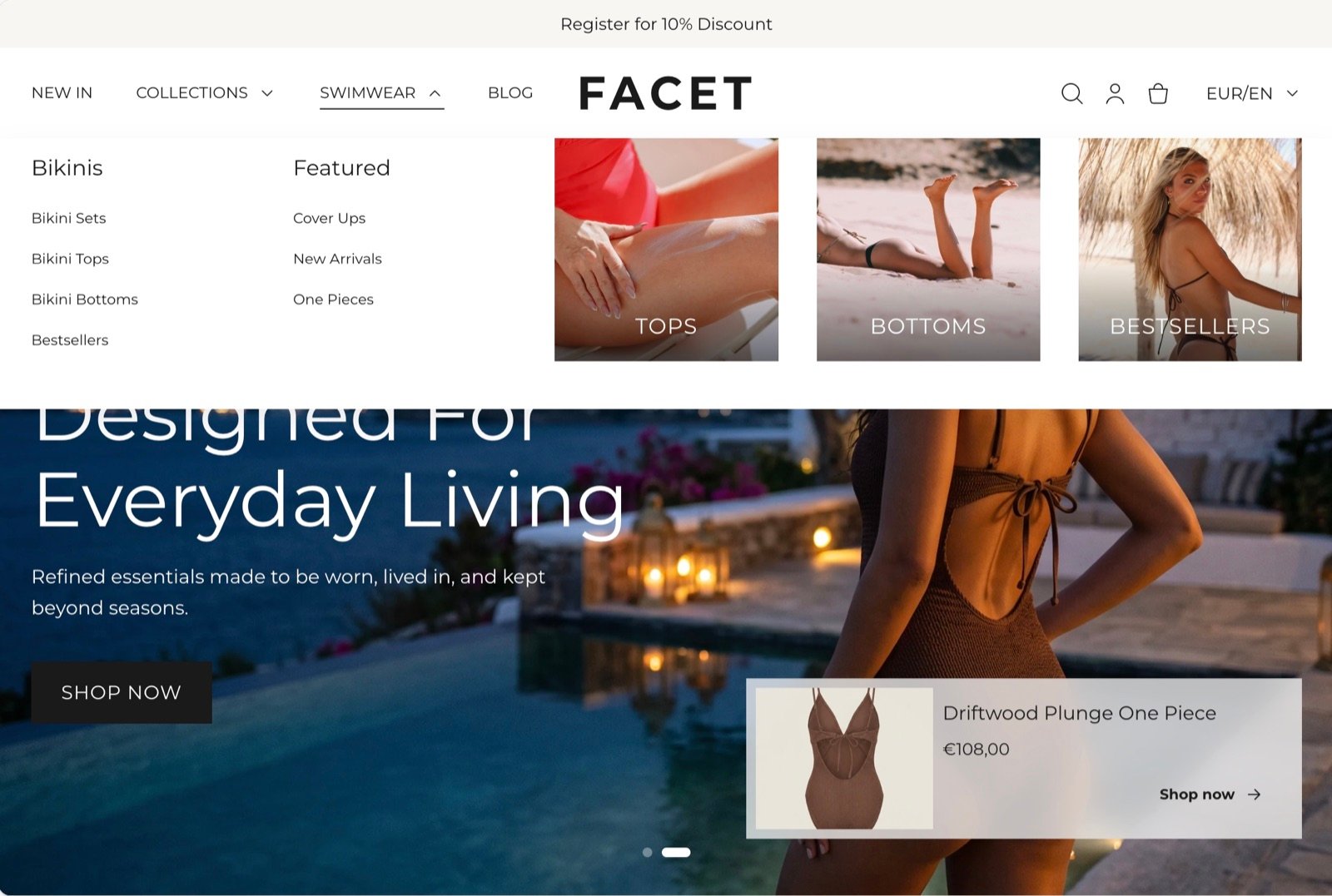
The shape of the pictures on menu cards: 1:1 (default), 4:5, 3:4, 2:3, 5:4, 4:3 or 16:9.
Image padding
Image padding
The space between a card’s edge and its picture: None (default), Small, Medium, Large or Extra large. Any padding shows the card color scheme around the picture.
Card color scheme
Card color scheme
Colors the card buttons and, when the picture has padding, the card background.
Logo and behavior
Logo position on large screens
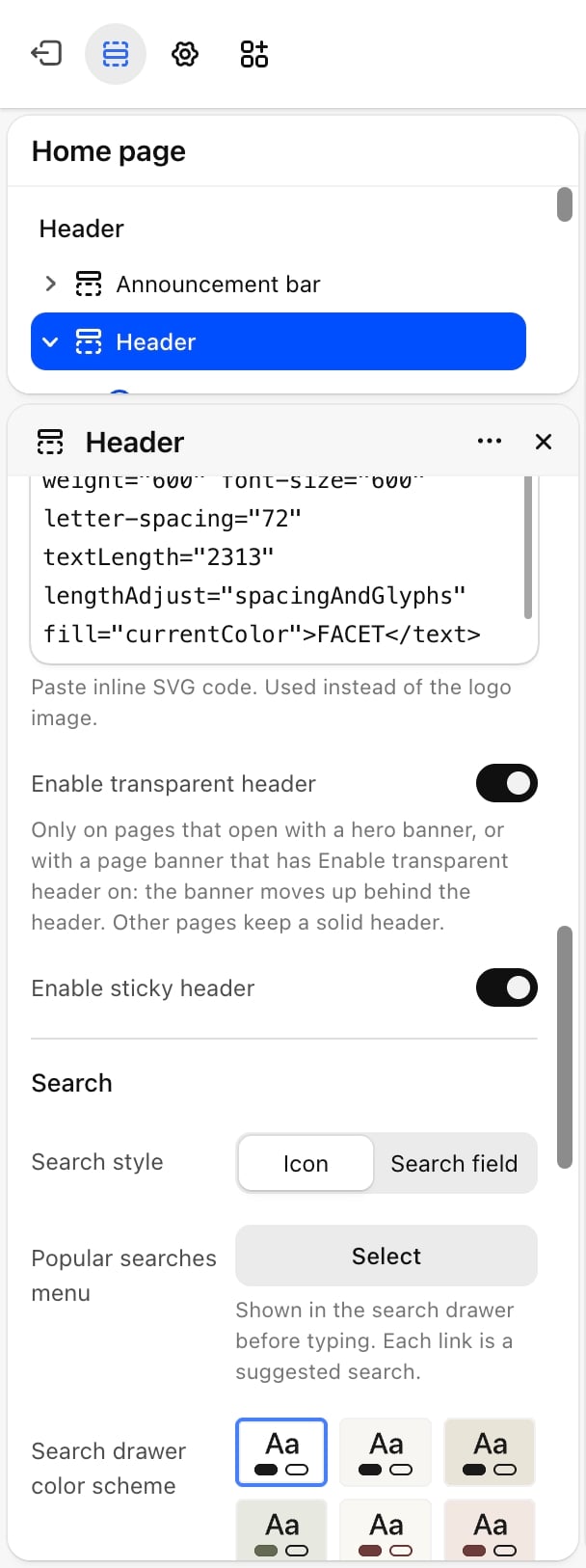
Logo position on large screens
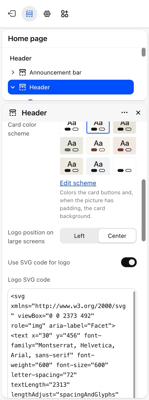
Left or Center (default). On phones the logo is always centered, between the menu button and the icons.
Use SVG code for logo
Use SVG code for logo
Off by default. Turn it on and paste inline SVG code into Logo SVG code to use it instead of the logo image.
Enable transparent header
Enable transparent header
Off by default. Lets the first banner on a page move up behind the header. This only happens on pages that open with a hero banner, or with a page banner that has its own Enable transparent header setting turned on. Other pages keep a solid header.
Enable sticky header
Enable sticky header
On by default. Keeps the header at the top of the screen while shoppers scroll.
Search
- Search style: Icon (default) opens a search drawer. Search field shows a search box in the header.
- Popular searches menu: links shown in the search drawer before a shopper types. Each link is a suggested search. Default: Main menu.
- Search drawer color scheme: the color scheme of the search drawer.
Country and language
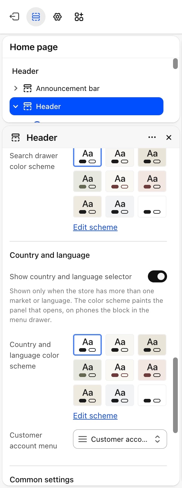
- Show country and language selector: on by default. The selector only appears when your store sells in more than one market or language.
- Country and language color scheme: colors the panel that opens, and on phones the selector inside the menu drawer. Appears only when Show country and language selector is on.
- Customer account menu: the menu shown to signed-in customers. Default: Customer account main menu.
Common settings
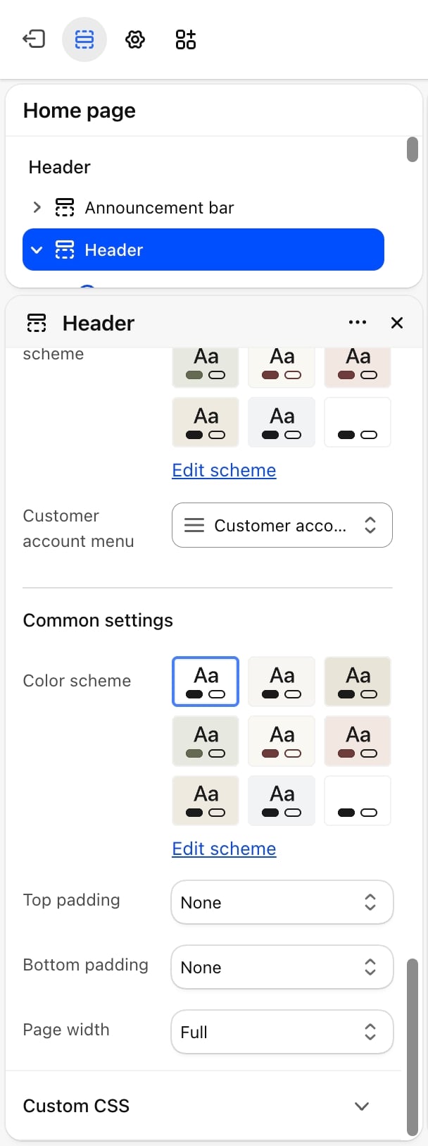
- Color scheme: the colors of the header bar.
- Top padding and Bottom padding: None (default), Small, Medium, Large or Extra large.
- Page width: Narrow, Narrower, Fluid (default) or Full.
Blocks
Menu card
A menu card shows a picture with a label or button inside the mega menu, under one item of the main menu. You can add up to 8 cards.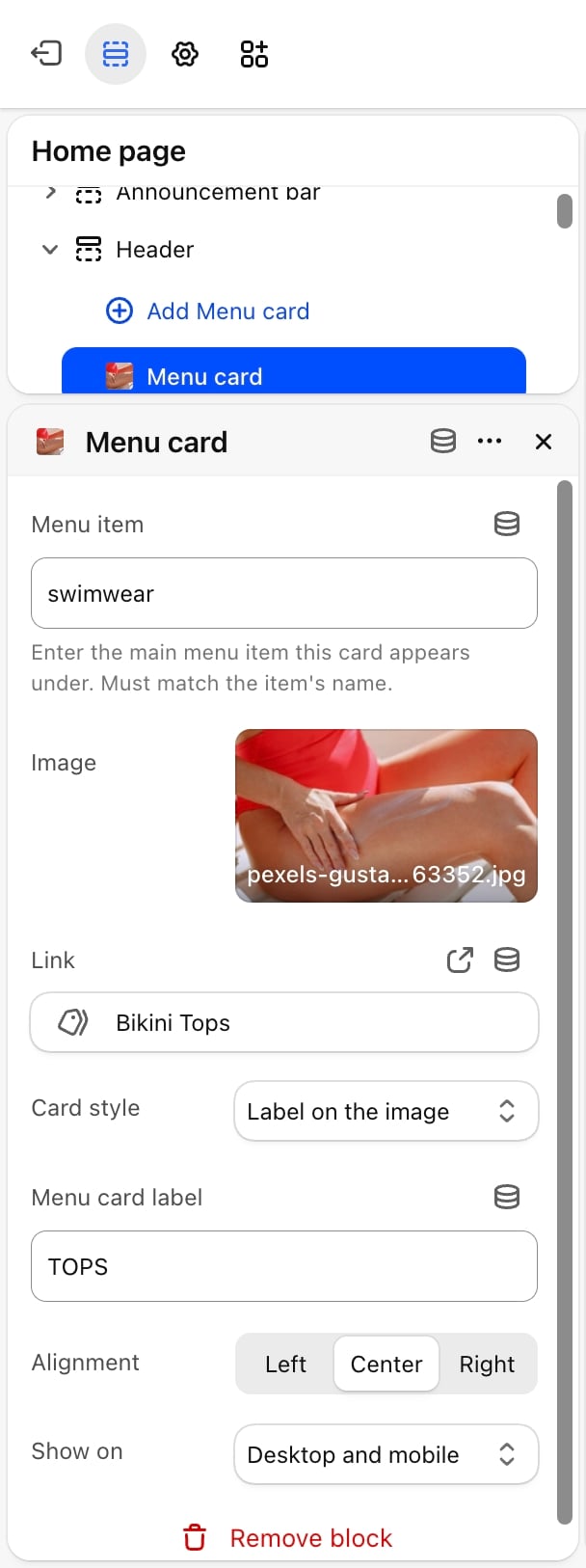
- Content
- Label on the image
- Menu item: the name of the main menu item this card appears under. It must match the item’s name (capitals and extra spaces are ignored).
- Image: the card picture.
- Link: where the card goes when clicked.
- Card style: Label on the image (default) or Button under the image. The other tabs list the settings for each style.
- Show on: Desktop and mobile (default), Desktop only or Mobile only.
Best practices
- Keep the main menu short. Five to seven top-level items fit on one line on most laptop screens.
- Match card names to the menu. If a menu card does not appear, check that Menu item matches the menu item’s name letter for letter (capitals don’t matter).
- Use the transparent header with a strong picture. Pick a Header color scheme over this banner on the hero banner so links and icons stay readable.
Related guides
Hero banner
Set the header colors used over each slide.
Colors
Create the color schemes the header uses.