

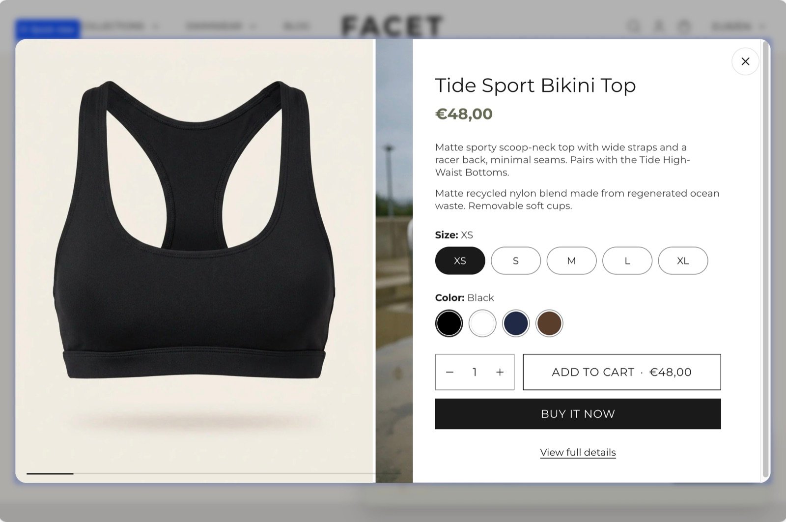
What this section controls
- The product shown in the quick view while you edit it in the Theme Customizer.
- Whether the quick view opens by itself in the Theme Customizer.
- The size of the product title.
- The quick view’s color scheme.
Getting started
1
Open the Theme Customizer
In your Shopify admin, open Online Store, then Themes, and click Customize next to Facet.
2
Select the quick view
In the Sections panel on the left, find the Overlay group and click Quick view. The quick view opens in the preview while it is selected. Your theme can have only one.
3
Pick a preview product
Choose a Preview product with several options and pictures, so you can judge the layout with real content.
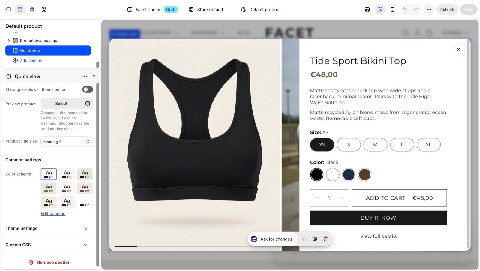
How shoppers open quick view
Product cards have a quick add button on their picture. What it does depends on the product:- Products with several variants, such as sizes or colors, show Choose options. It opens the quick view so the shopper can pick a variant.
- Products with one variant show Add to cart. It adds the product straight to the cart and opens the cart drawer, without the quick view.
- Sold-out products have no button.
- Collection pages and search results.
- The Featured collection, Related products and Recently viewed sections.
- The recommendations in the cart drawer, where Add to cart opens the quick view for products with several variants.
Facet starts loading a product’s quick view as soon as the pointer rests on its card, so the dialog usually opens without a wait. If the quick view section is removed, or the product can’t be loaded, Choose options opens the product page instead.
What quick buy shows
Quick buy is the product panel inside the quick view. It is a hidden part of the theme with no settings and doesn’t appear in the Sections panel. You style it with the quick view settings below and with Theme settings such as Variants and Buttons. On desktop the quick view is a centered dialog with the pictures beside the details. On phones it slides up from the bottom of the screen. It shows:- Pictures: every picture and video of the product, one at a time, with arrows and a progress bar. Choosing a variant moves to that variant’s picture.
- Title and price: the price follows the chosen variant, with the compare-at price when the variant is on sale.
- Description: a long description is folded to a few lines with a Read more button.
- Options: one row of buttons per option. Options named in Color option names in Variants show as color swatches, unless Color option style is set to Text. Unavailable values are marked.
- Low stock note: “Hurry! Only [count] left in stock” when Shopify tracks the variant’s inventory and 5 or fewer are left.
- Quantity and Add to cart: the button shows the price of the chosen variant, or Sold out. After adding, the quick view closes and the cart drawer opens.
- Express checkout buttons: such as Shop Pay, as set up in your store’s payment settings.
- View full details: a link to the product page.
Section settings
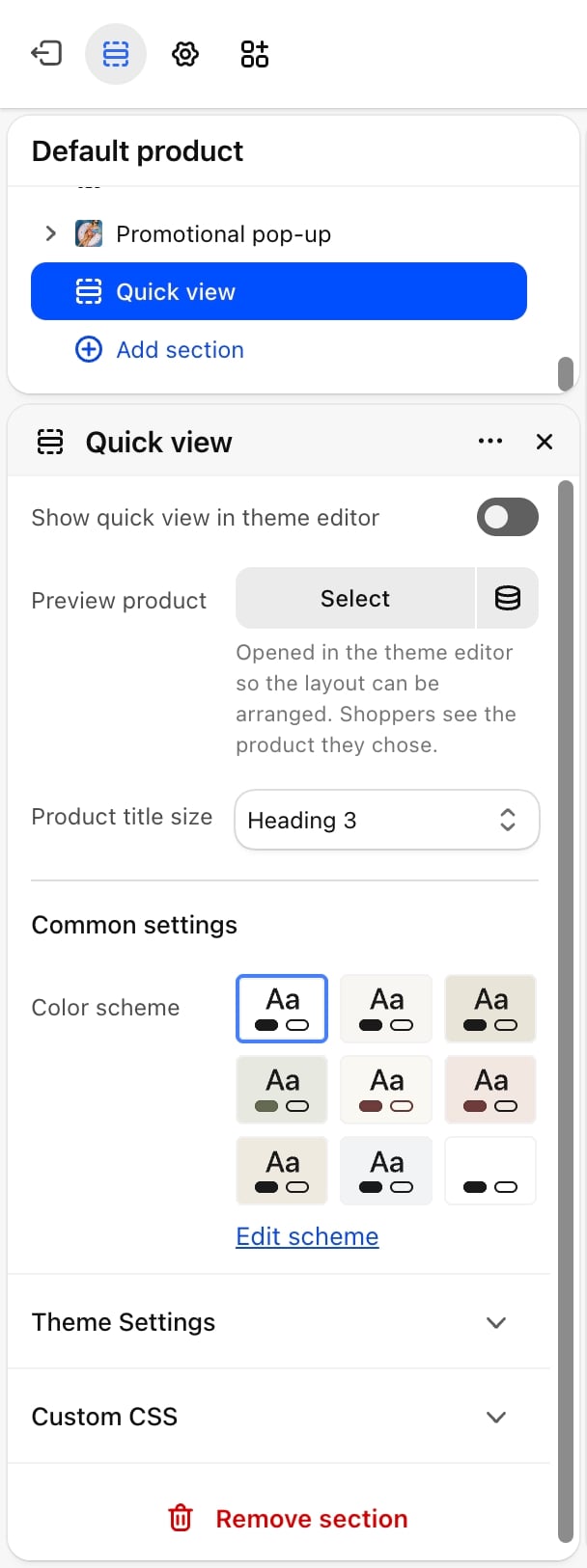
Theme Customizer preview
- Show quick view in theme editor: off by default. Opens the quick view as soon as the preview loads. Whether it is on or off, the quick view opens when you click Quick view in the Sections panel and closes when you click another section.
- Preview product: the product shown in the quick view in the Theme Customizer. Shoppers always see the product they chose. Without one, the first product in your store is used.
Product title
- Product title size: Heading 2, Heading 3 (default), Heading 4 or Heading 5.
Common settings
- Color scheme: the colors of the quick view.
Best practices
- Give products good first pictures. The gallery takes its shape from the first picture, so a clear, well-cropped main picture makes the dialog look tidy.
- Assign pictures to variants. When each color variant has its own picture, choosing a color shows it straight away.
- Keep descriptions scannable. Only the first lines show before Read more, so put sizing and fabric details at the top.
Related guides
Cart drawer
Set up the drawer that opens after a product is added.
Product cards
Style the product cards that hold the quick add button.