

What these settings control
- The maximum width of the content column on large screens.
- The smallest gap between the content and the edge of the screen.
- The real widths behind each section’s Page width options.
How to access
1
Open the Theme Customizer
In your Shopify admin, open Online Store, then Themes, and click Customize next to Facet.
2
Open Theme settings
Click the Theme settings icon in the left sidebar.
3
Open Layout
Expand Layout.
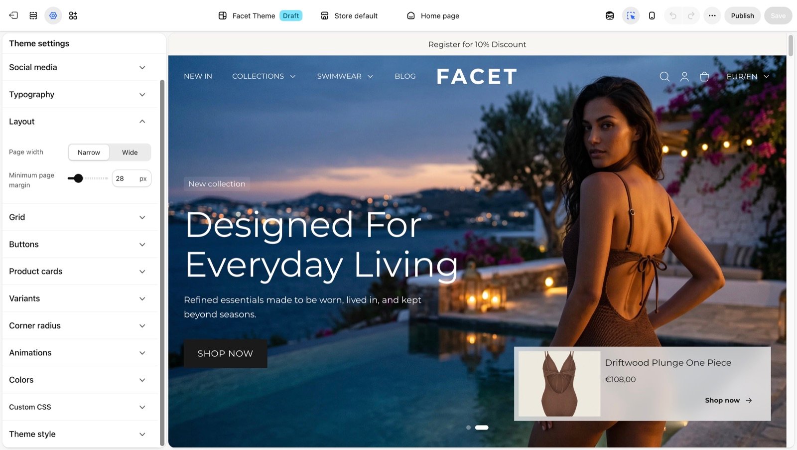
Layout settings
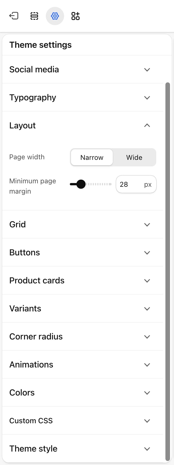
Page width
Page width
The widest your content gets. On screens wider than this, the content stays centered and the extra space goes to the sides.
- Narrow (default): 1440 pixels.
- Wide: 1760 pixels.
Minimum page margin
Minimum page margin
From 10 to 100 pixels. Default: 100. The smallest space kept between the content and each side of the screen on large screens. On screens narrower than 990 pixels, Facet uses a fixed 16 pixel margin instead.
How sections use these values
Each section has a Page width setting under Common settings. Its options are measured from the values above. With the defaults (Narrow page width and a 100 pixel margin):- Regular: the page width minus the margin on each side, so 1240 pixels.
- Narrow: 1024 pixels (about 1250 pixels with a Wide page width).
- Narrower: about 680 pixels (about 830 pixels with a Wide page width).
- Fluid and Full ignore the page width and use the whole screen.
Best practices
- Pick Wide for picture-led stores. A wider page gives large photos and four-column product grids more room on big monitors.
- Keep Narrow for text-heavy stores. Lines of text are easier to read when they don’t stretch across a wide screen.
- Lower the margin with care. A small margin brings content close to the screen edge on laptops, which can feel cramped next to the browser frame.
Related guides
Common settings
Set each section’s page width and padding.
Grid
Set the gaps between cards inside the content column.