

What these settings control
- The corners of primary, secondary and tertiary buttons across the store.
- The corners of the small quick add buttons on product cards and of other small buttons on product pages.
- The cut corners of the cards in the Socials section, when the style is Diagonal.
How to access
1
Open the Theme Customizer
In your Shopify admin, open Online Store, then Themes, and click Customize next to Facet.
2
Open Theme settings
Click the Theme settings icon in the left sidebar.
3
Open Buttons
Expand Buttons and pick a Corner style.
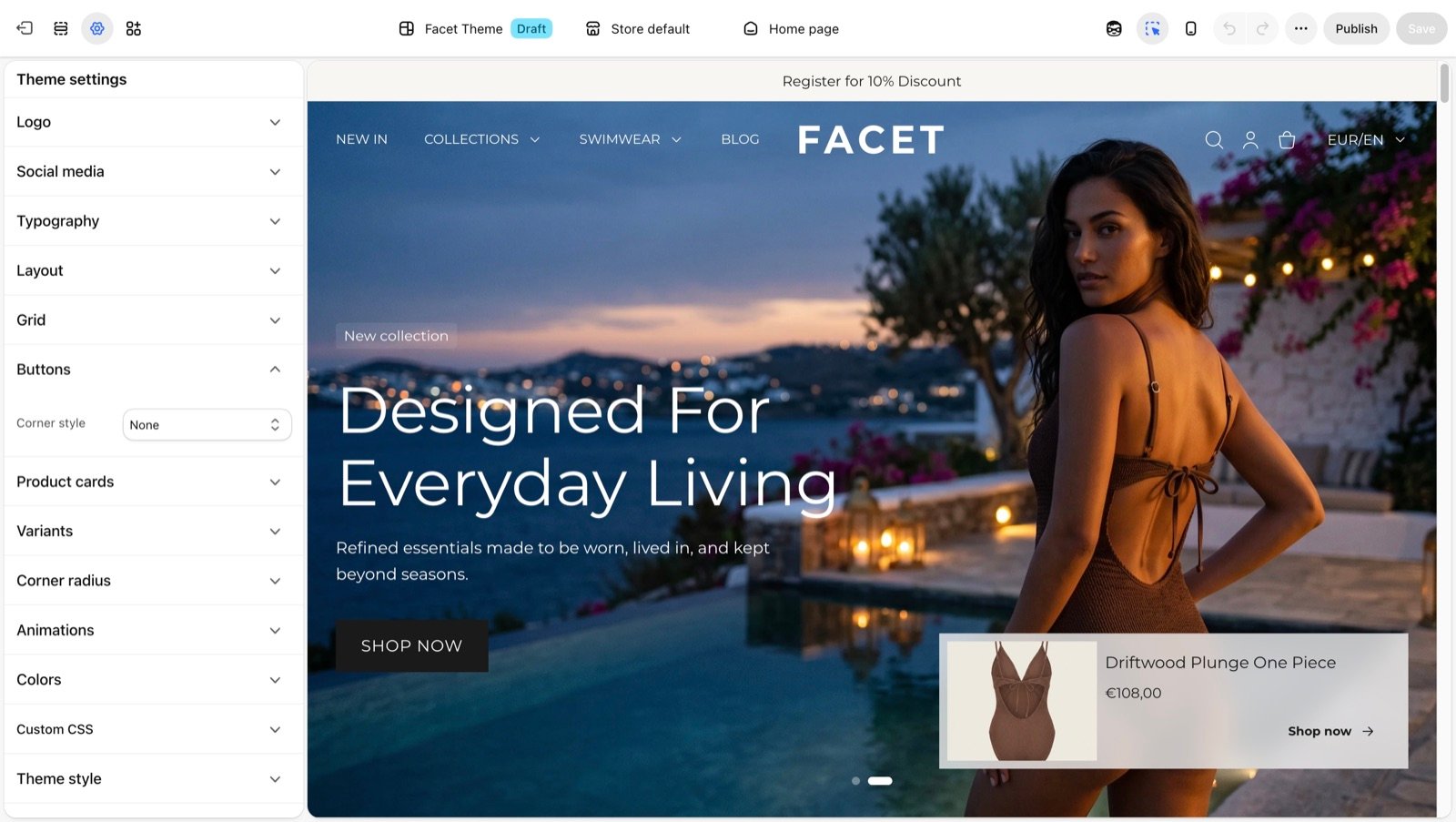
Button settings
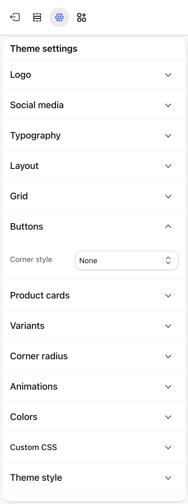
Corner style
Corner style
- Diagonal: square buttons with each corner cut off at an angle, like an octagon. Outlined buttons draw the same cut-corner outline.
- Rounded: fully rounded ends, like a pill.
- Soft rounded (default): slightly rounded corners (10 pixels).
- None: square corners.
Every button uses the body font in capital letters. Change the font in Typography.
Best practices
- Match the corner radius. Soft rounded buttons sit well with Medium or Large card and input corners. Square buttons sit well with None. Set them in Corner radius.
- Check short labels with Diagonal. The cut corners take a little space at each end, so preview buttons with one-word labels.
- Look at the product page. It holds the most buttons in one place, so it shows quickly whether a style fits your brand.
Related guides
Corner radius
Round the corners of form fields and cards.
Theme blocks
Add buttons to sections with the Button block.