

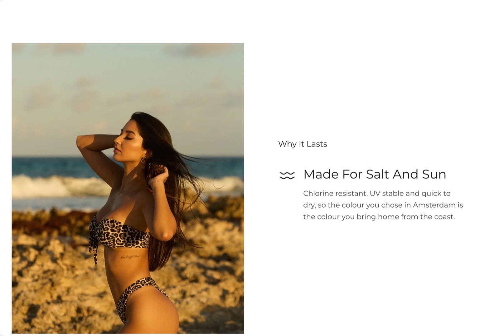
What this section controls
- Which side the pictures sit on, their shape, width and spacing on desktop.
- How faded the pictures that are not current look on desktop.
- Whether the section changes color with each highlight.
- An optional heading and text above the highlight text.
How the scrolling works
- Desktop
- Phones and tablets
The pictures sit in one column and scroll with the page. The text column beside them stays in the middle of the screen while the pictures pass.The picture closest to the middle of the screen is the current one. It shows in full, and the other pictures fade back. As a new picture reaches the middle, its text replaces the text before it. Clicking a picture scrolls it to the middle.
Getting started
1
Open the Theme Customizer
In your Shopify admin, open Online Store, then Themes, and click Customize next to Facet.
2
Add the section
In the Sections panel, click Add section and choose Scrolling highlights. It can’t be added to the header or footer.
3
Fill each highlight
Click a Highlight block to pick its picture and edit its heading and text. Click Add block, then Highlight, to add another.
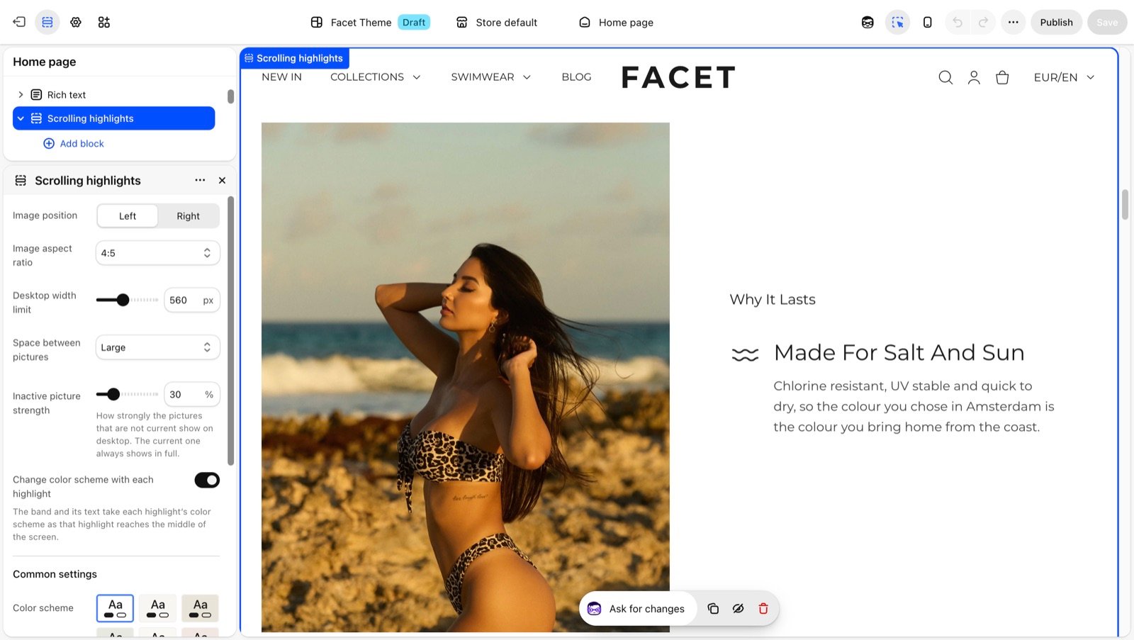
Section settings
Pictures
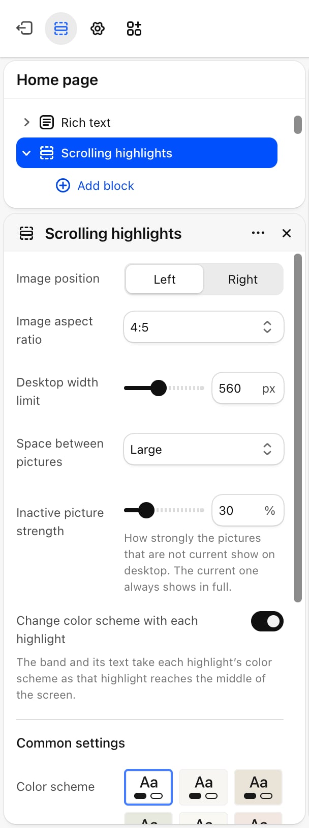
Image position
Image position
Left (default) or Right. The side of the picture column on desktop.
Image aspect ratio
Image aspect ratio
The shape of every highlight picture: 1:1 (default), 4:5, 3:4, 2:3, 5:4, 4:3 or 16:9. Pictures are cropped to fit.
Desktop width limit
Desktop width limit
The widest a picture can be on desktop: from 320 to 900 pixels. Default: 620. A narrower picture is centered in its column.
Space between pictures
Space between pictures
The gap between pictures on desktop: Small, Medium, Large (default) or Extra large.
Inactive picture strength
Inactive picture strength
How strongly the pictures that are not current show on desktop: from 10% to 100%. Default: 30%. The current picture always shows in full. At 100% no picture fades.
Colors
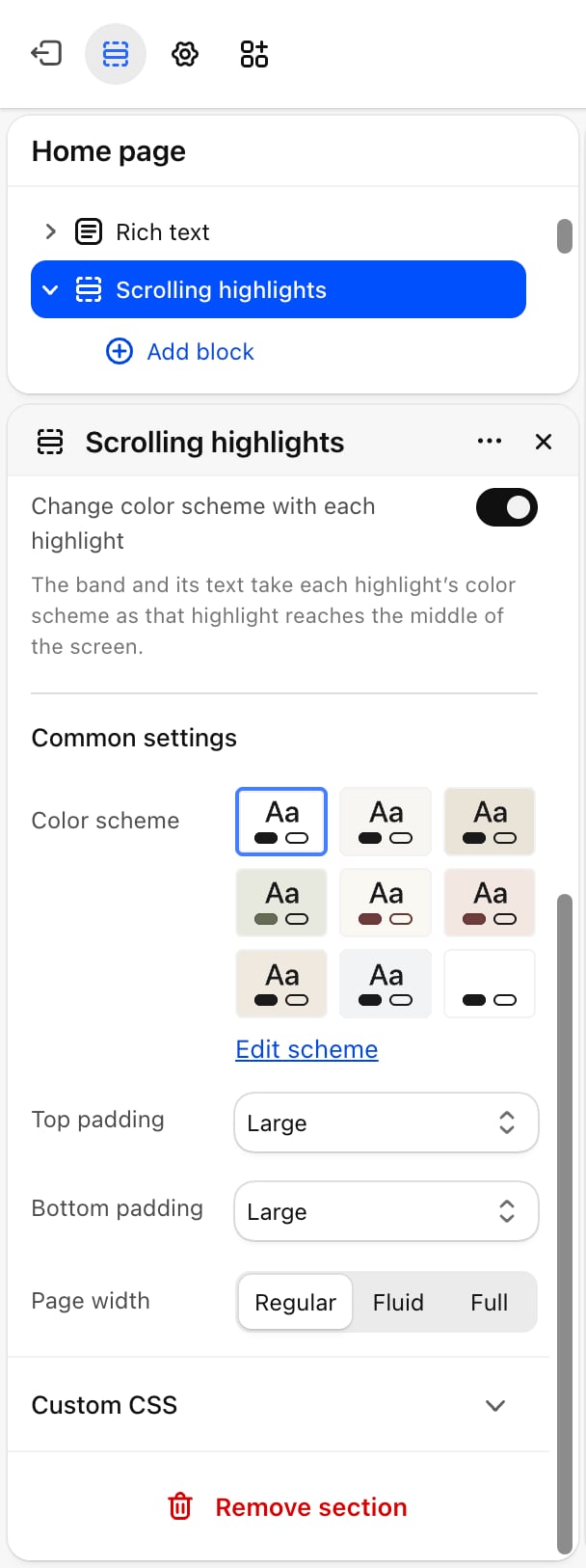
- Change color scheme with each highlight: off by default. When on, the whole band and its text take each highlight’s Color scheme as that highlight reaches the middle of the screen, with a soft fade between them.
Common settings
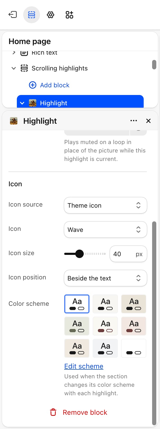
- Color scheme: the colors of the section. With Change color scheme with each highlight on, the highlights’ schemes paint over it.
- Top padding and Bottom padding: None, Small, Medium, Large (default) or Extra large.
- Page width: Regular (default), Fluid or Full.
Blocks
Heading and text
The section has a fixed Heading and Text above the highlight text. A new section starts with the heading “Why it lasts” and an empty text. Empty either one to hide it. See Theme blocks for their settings.Highlight
Each highlight is one picture and its text. Add as many as you need and drag them to change their order.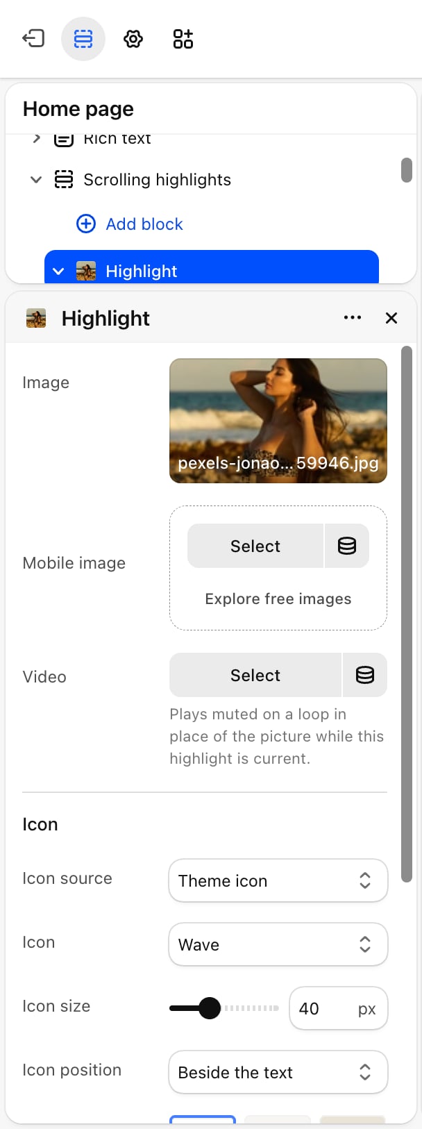
- Media
- Icon
- Color scheme
- Nested blocks
- Image: the highlight picture. A placeholder shows until you pick one.
- Mobile image: an optional picture for phones. Without one, phones show Image.
- Video: plays muted on a loop in place of the picture while this highlight is current.
Best practices
- Use three to five highlights. Fewer don’t show off the scroll effect, more make the section long on desktop.
- Keep each text short. The text column holds one highlight at a time, sized to the picture. A heading and two or three lines fit best.
- Pick contrasting color schemes for the tint. With the color change on, schemes that differ clearly make each step easy to notice.
- Add mobile images for wide pictures. Phones show one picture across the screen, so a square or portrait crop fills it better.
Related guides
Colors
Create the color schemes each highlight can take.
Image with text
Show one picture beside text without the scroll effect.