

What these settings control
- Your logo, its width and the browser tab icon.
- The color schemes that sections and blocks pick from.
- The heading and body fonts.
- The maximum page width, the side margins and the gaps between grid items.
- The corner shape of buttons, form fields, cards and variant options.
- How product cards show their pictures and text.
- Which product options show as color swatches.
- Your social media links and the reveal motion as shoppers scroll.
How to access
1
Open the Theme Customizer
In your Shopify admin, open Online Store, then Themes, and click Customize next to Facet.
2
Open Theme settings
Click the Theme settings icon in the left sidebar.
3
Open a group
Click a group, such as Typography, to expand it. Changes show in the preview right away. Click Save to publish them.
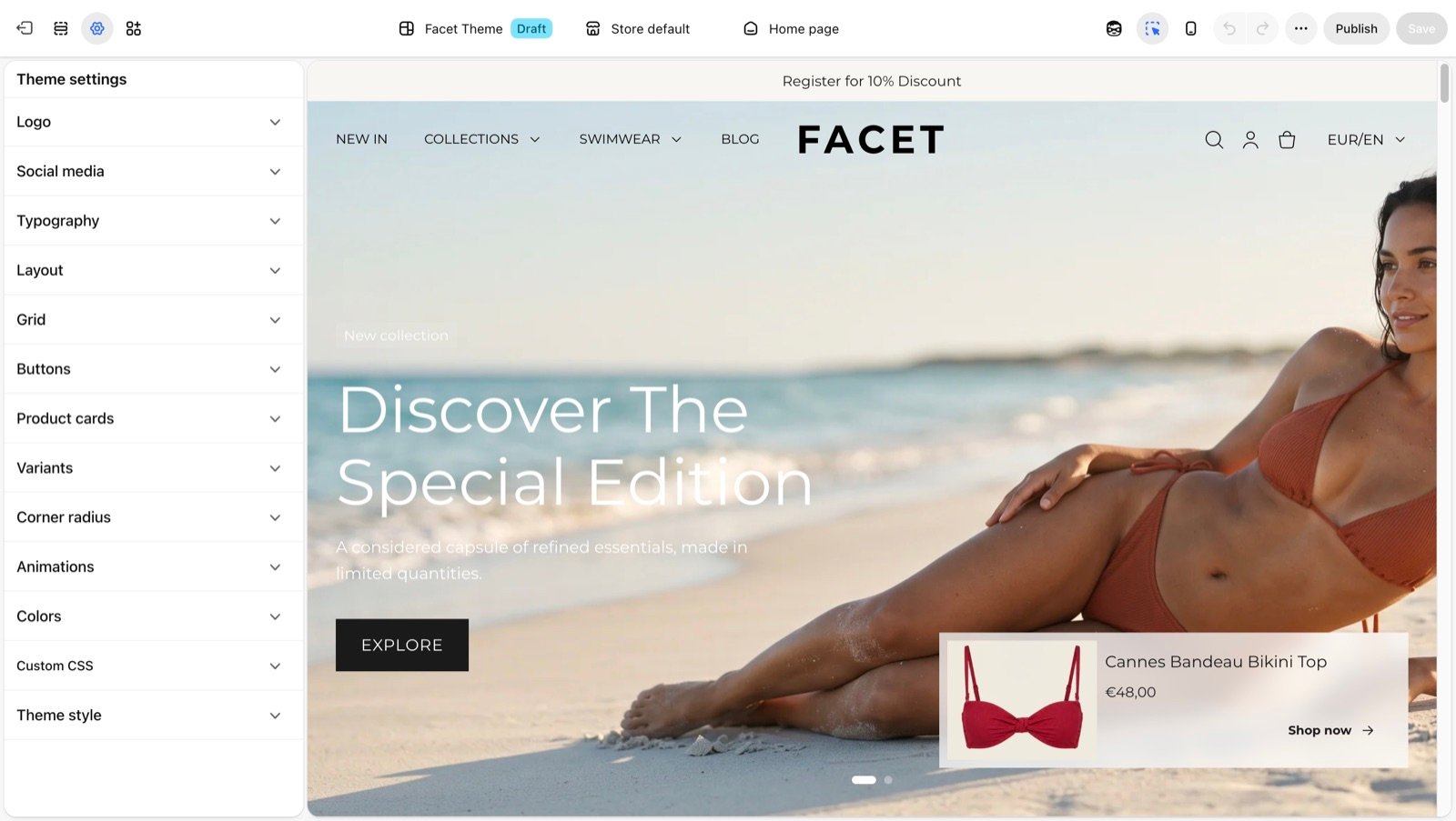
Settings groups
Logo
Upload your logo, set its width and add a favicon.
Colors
Create the color schemes used by sections and blocks.
Typography
Pick the heading font and the body font.
Layout
Set the maximum page width and the side margins.
Grid
Set the gaps between cards in product and content grids.
Buttons
Choose the corner style of every button.
Product cards
Set the picture shape, text alignment and borders of product cards.
Variants
Show color options as swatches and set the shape of option boxes.
Corner radius
Round the corners of form fields and cards.
Social media
Add the links behind your social media icons.
Animations
Turn the reveal motion on scroll on or off.
Recommended order
When you set up a new store, work through the groups in this order. Each step builds on the one before, so you rework less later.- Logo: upload your logo and favicon so every page carries your brand.
- Colors: set up your color schemes before you pick schemes on sections.
- Typography: choose fonts once your colors are in place.
- Layout and Grid: set the page width, margins and grid gaps.
- Buttons and Corner radius: match the shapes to your brand.
- Product cards and Variants: check them on a collection page and a product page.
- Social media and Animations: add your links and decide on scroll motion.
Best practices
- Change one group at a time. Check the preview on a home, collection and product page before you move on.
- Preview on a phone. Use the phone view at the top of the Theme Customizer. Margins, gaps and font sizes change on small screens.
- Duplicate the theme first. Before large changes on a live store, duplicate Facet in Online Store > Themes and try them on the copy.
Related guides
Common settings
The color scheme, padding and width settings each section has.
Theme blocks
Build sections from headings, text, buttons and other blocks.