

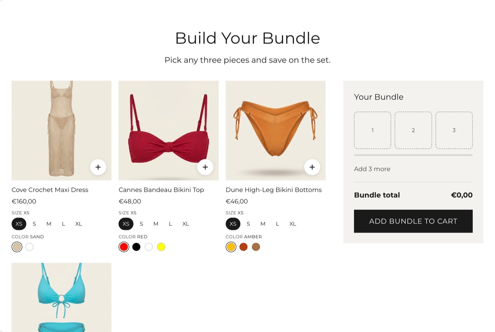
What this section controls
- The products shoppers can pick from, up to 8.
- How many products make a complete bundle.
- Whether the bundle starts already filled.
- The savings note and the button text in the bundle panel.
- The picture shape and the option picker style on the product cards.
Getting started
1
Open the Theme Customizer
In your Shopify admin, open Online Store, then Themes, and click Customize next to Facet.
2
Add the section
In the Sections panel, click Add section and choose Bundle and save. The section can’t be added to the header or footer.
3
Pick the products
Click each Bundle product block and choose a Product. Click Add block, then Bundle product, to offer more products.
4
Create the discount
In your Shopify admin, open Discounts and create the discount the bundle promises. See How the bundle discount works.
How the bundle discount works
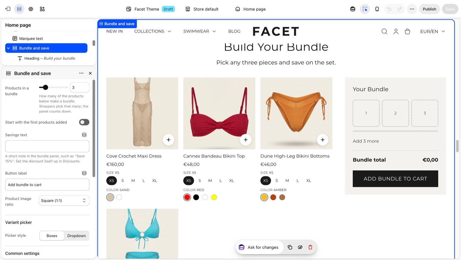
The section adds each chosen product to the cart once, at its normal price. The total in the bundle panel is the sum of those prices. When a product has a compare-at price, the panel also shows the higher regular total crossed out. The Add bundle to cart button works as soon as one product is in the bundle, so shoppers can also add an incomplete bundle. A minimum quantity on your discount makes sure the saving only applies to a full bundle.Section settings
Bundle
Products in a bundle
Products in a bundle
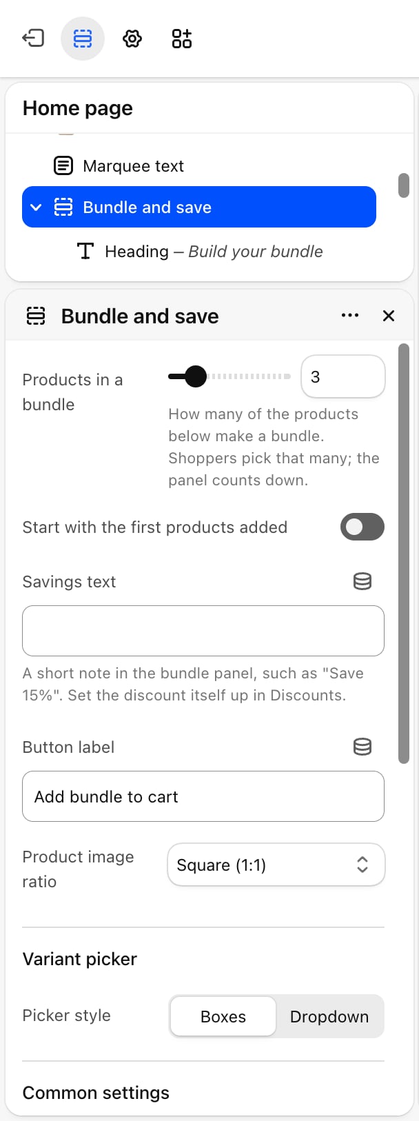
How many products make a complete bundle: from 2 to 8. Default: 3. The panel shows one slot per product and counts down how many more to add. Once the bundle is full, the other cards can’t be added until a product is removed.If you pick fewer products than this number, the bundle size drops to the number of products you picked.
Start with the first products added
Start with the first products added
Off by default. When on, the bundle opens already filled with the first products in the list, as many as Products in a bundle. Shoppers can remove them and choose others.
Savings text
Savings text
A short note in the bundle panel, such as “Save 15%”. It is display text only. Set up the discount itself in Discounts.
Product image ratio
Product image ratio
The shape of the pictures on the product cards: Adapt to image, Square (1:1) (default), Portrait (4:5), Portrait (3:4), Portrait (2:3), Landscape (4:3) or Landscape (3:2). Adapt to image keeps each picture’s own shape.
Variant picker
- Picker style: how shoppers choose a product’s options on each card. Boxes (default) shows each value as a button, and color options as swatches, like the product page. Dropdown shows every option as a dropdown list. Values that are sold out with the other options as chosen are faded or marked sold out.
Common settings
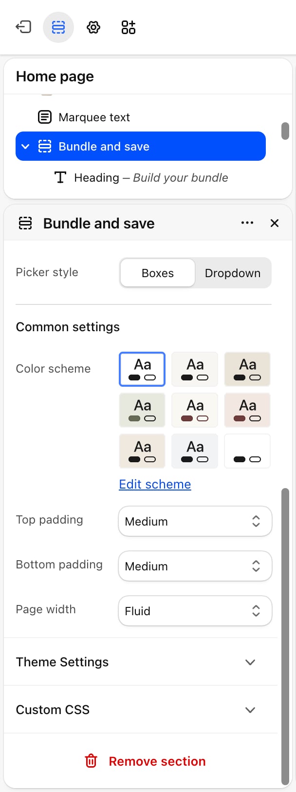
- Color scheme: the colors of the whole section.
- Top padding and Bottom padding: None, Small, Medium, Large (default) or Extra large.
- Page width: Narrow, Narrower, Fluid (default) or Full.
Blocks
The section holds up to 8 blocks.Intro heading and text
The section has a fixed Heading and Text block above the products. Their settings are described on Theme blocks.Bundle product
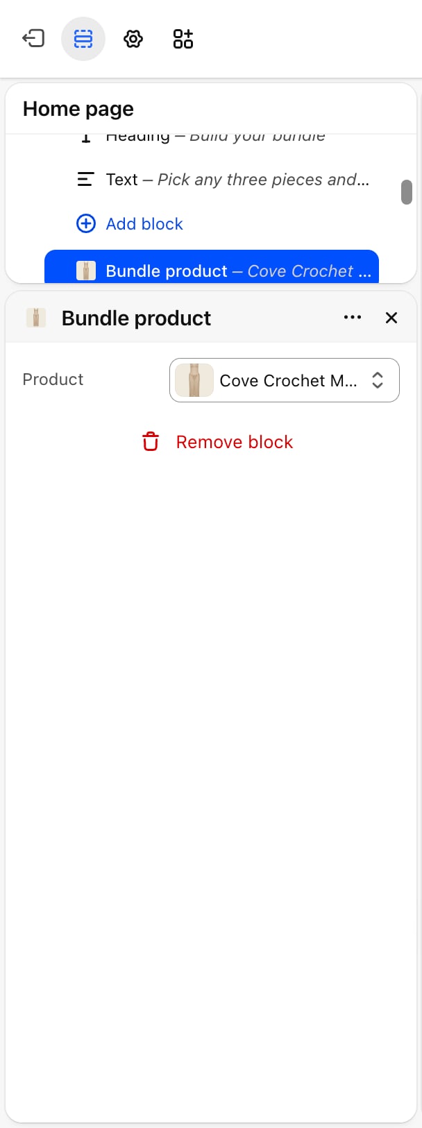
- Product: the product on the card. Until you pick one, the card shows a placeholder that can’t be added, and it doesn’t count toward the bundle size.
On large screens the bundle panel stays beside the cards while shoppers scroll. On phones it sits along the bottom of the screen. After the bundle is added, the cart drawer opens.
Best practices
- Create the discount first. Set up the discount in Discounts before you publish the section, and test it with a full bundle in the cart.
- Match the numbers. Make sure Savings text, Products in a bundle and your discount’s minimum quantity all describe the same offer.
- Offer more products than the bundle needs. With 6 products for a bundle of 3, shoppers have a real choice.
- Use one picture shape. Pick a fixed Product image ratio when your product photos have different shapes, so the cards line up.
Related guides
Variants
Choose which options show as color swatches on the cards.
Cart drawer
The drawer that opens after the bundle is added.