

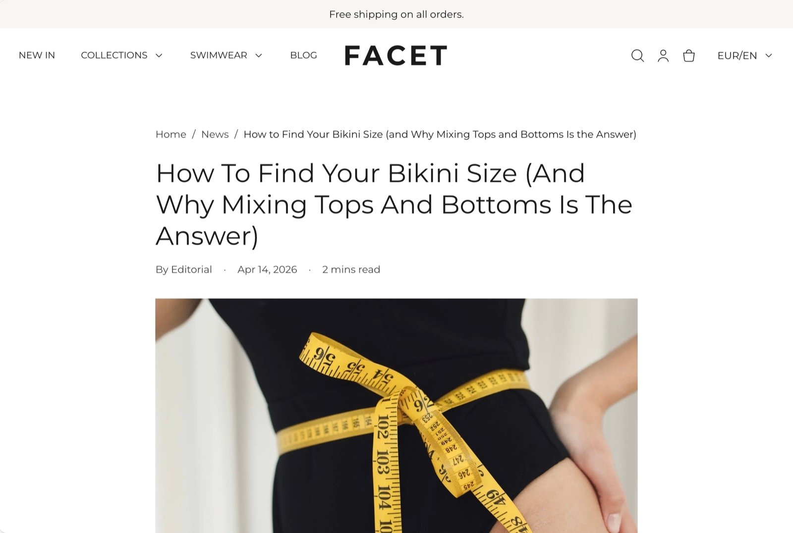
What this section controls
- The breadcrumb trail above the post.
- Which parts of the post appear, and in what order.
- The size and alignment of the title.
- The crop of the featured image.
- The share buttons and the comment list.
- The colors, spacing and width of the post column.
Getting started
1
Open the Theme Customizer
In your Shopify admin, open Online Store, then Themes, and click Customize next to Facet.
2
Open a blog post
In the page selector at the top of the Customizer, choose Blog posts, then pick a post to preview. Click Article in the Sections panel.
3
Arrange the post
Drag the blocks to change their order, or hide the ones you don’t need. Click Add block to bring back a block you removed.
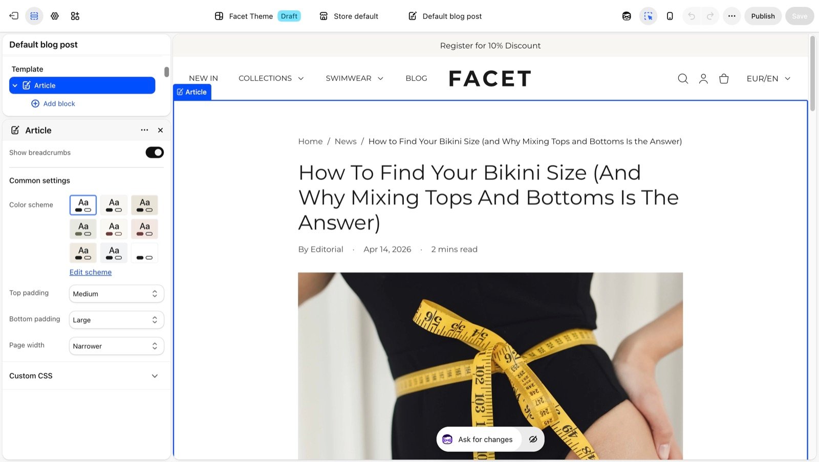
Section settings
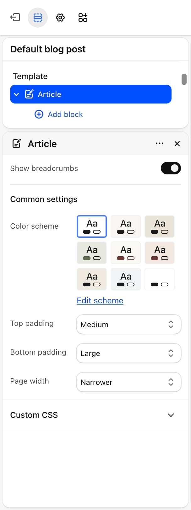
- Show breadcrumbs: on by default. Shows the path to the post (home, blog, post) above it.
Common settings
These work the same in every section. See Common settings for details.- Color scheme: the colors of the post.
- Top padding: None, Small, Medium (default), Large or Extra large.
- Bottom padding: None, Small, Medium, Large (default) or Extra large.
- Page width: Narrow, Narrower (default), Fluid or Full. Every block sits in one column at this width, so the picture, the post links and the comments line up with the text.
Blocks
Every block below has a Bottom padding setting that sets the space under it: None, Extra small, Small, Medium, Large or Extra large. The last block on the page adds no space, since the section’s bottom padding closes the column. The section also accepts app blocks.Title
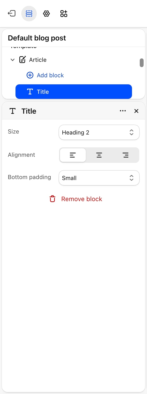
- Size: Display 1, Display 2, Heading 1, Heading 2 (default), Heading 3 or Heading 4.
- Alignment: left (default), center or right.
- Bottom padding: default Small.
Author and date
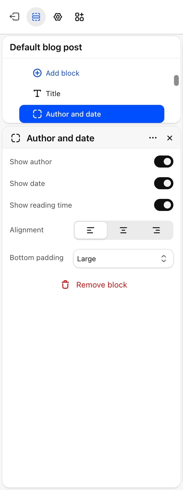
- Show author: on by default. Shows “By” and the author’s name.
- Show date: on by default. Shows the date the post was published.
- Show reading time: on by default. Estimates the minutes needed to read the body, at 200 words a minute, with a minimum of 1.
- Alignment: left (default), center or right.
- Bottom padding: default Large.
Featured image
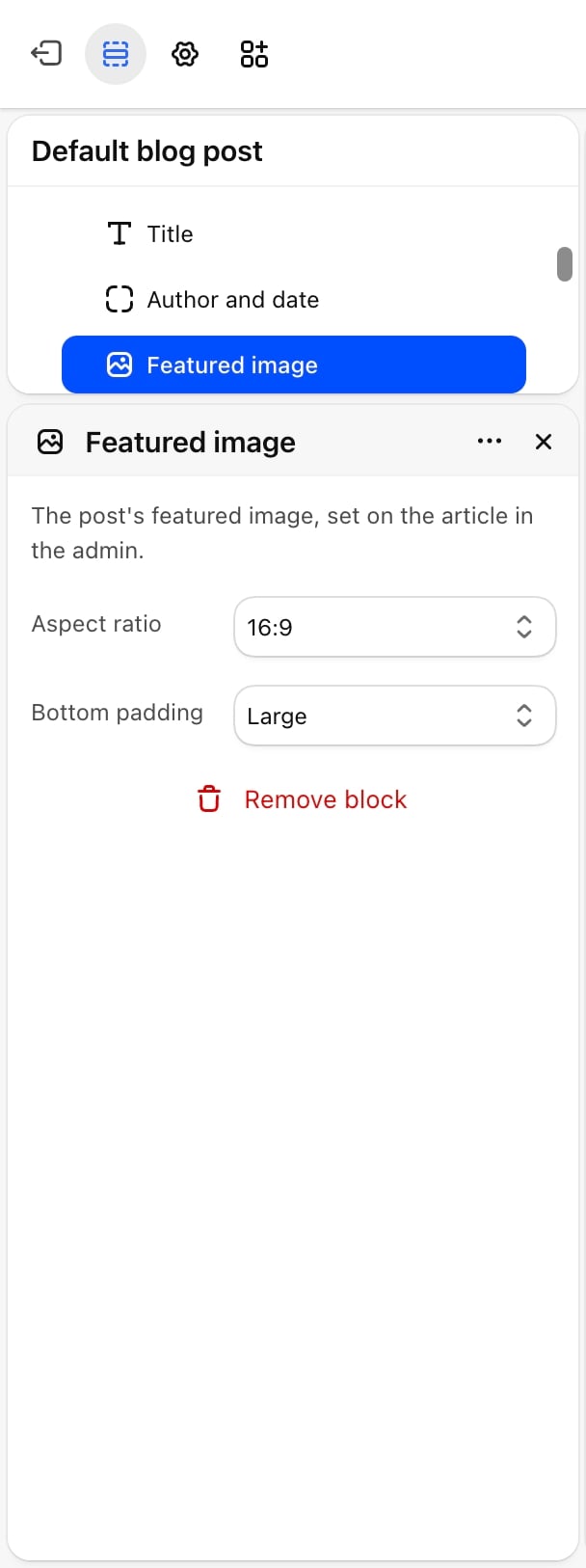
- Aspect ratio: Natural, 21:9, 16:9 (default), 4:3, 5:4, 1:1, 4:5 or 3:4. Natural keeps the picture’s own shape. The others crop it.
- Bottom padding: default Large.
Body
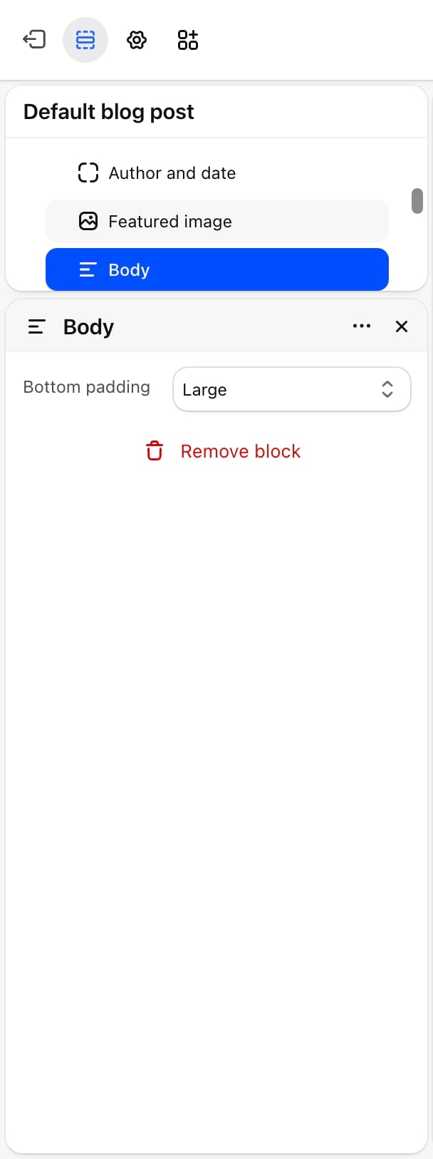
- Bottom padding: default Large.
Tags
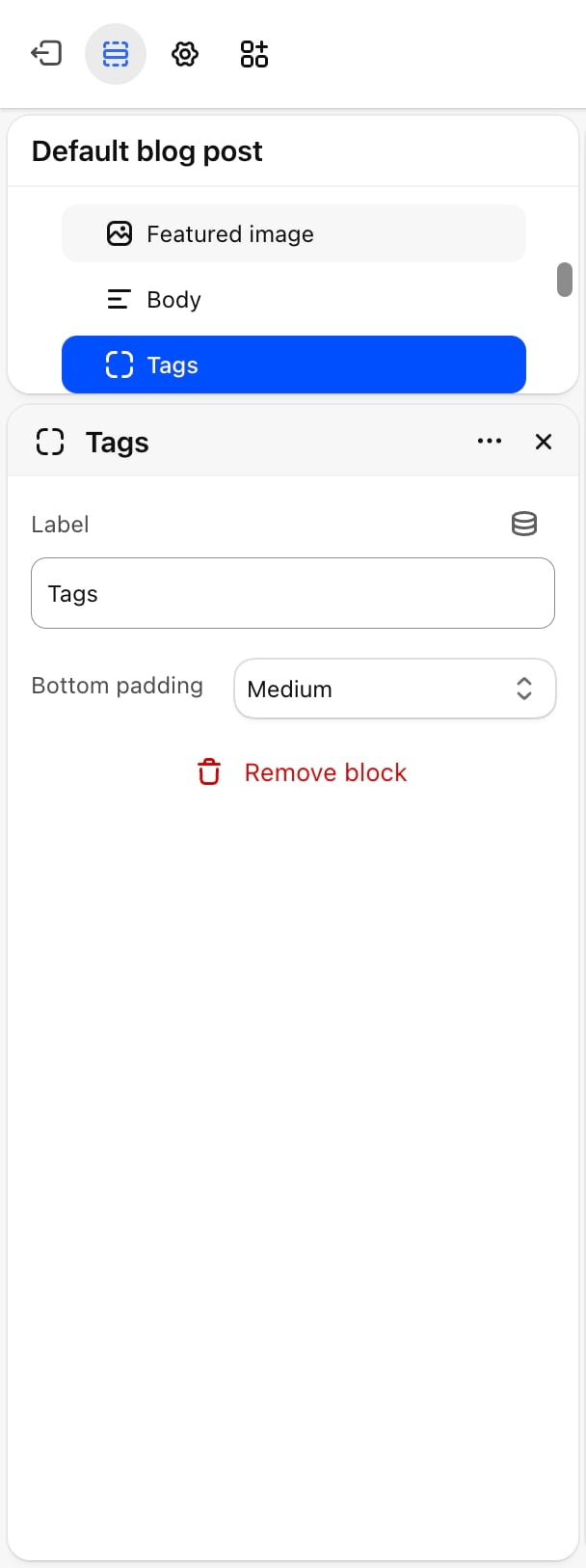
- Label: the text before the tags. Default: “Tags”. Leave it blank to show the tags alone.
- Bottom padding: default Large.
Share
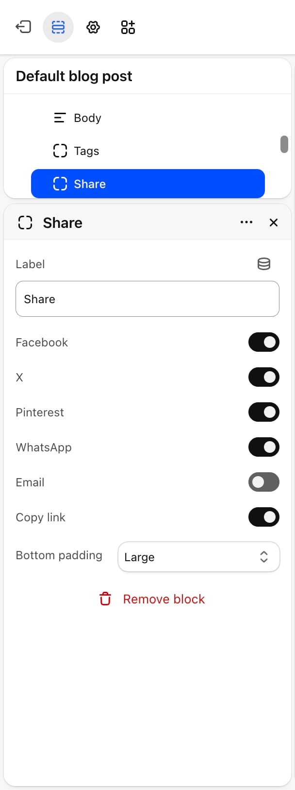
- Label: the text before the buttons. Default: “Share”. Leave it blank to show the buttons alone.
- Facebook: on by default.
- X: on by default.
- Pinterest: on by default. Shares the post’s featured image when it has one.
- WhatsApp: off by default.
- Email: off by default. Opens the reader’s email app with the post title and link filled in.
- Copy link: on by default. Copies the post’s address. The button hides itself in browsers that don’t allow copying.
- Bottom padding: default Large.
Previous and next posts
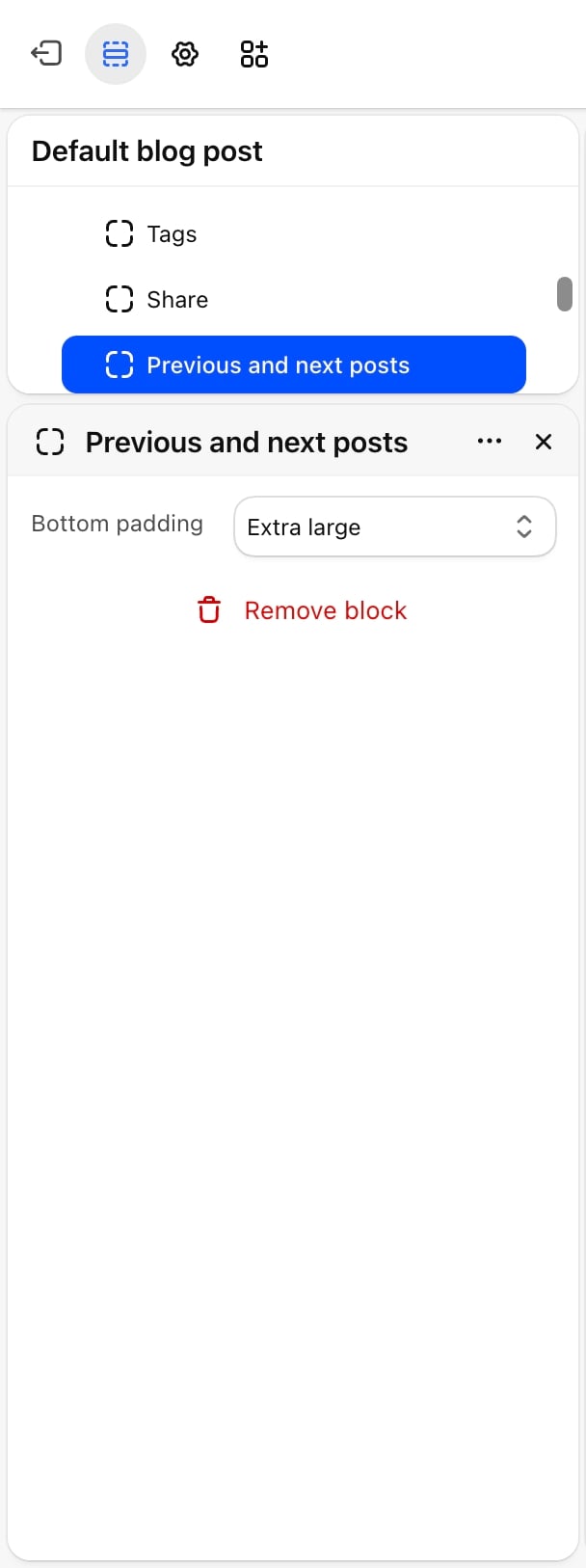
- Bottom padding: default Extra large.
Comments
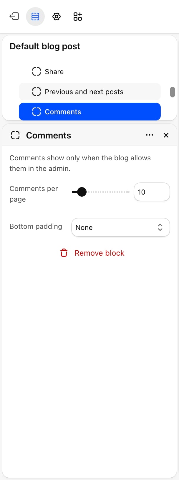
- Comments per page: from 5 to 50, in steps of 5. Default: 10. Longer lists get page numbers.
- Bottom padding: default Extra large.
Related posts
Below the Article section, Facet’s blog post template has a Related posts section with more posts from the same blog. Its settings are described in Related posts.Best practices
- Pick one image shape for the whole blog. The same Aspect ratio on every post keeps the blog page and related posts tidy.
- Use tags as categories. A short, fixed list of tags makes the tag buttons on posts and the tag filter on the blog page useful.
- Choose a narrow width for long posts. Narrow or Narrower keeps lines short enough to read comfortably.
- Keep share buttons to the networks your readers use. Two or three buttons are easier to scan than six.
Related guides
Blog page
Set up the page that lists your posts.
Related posts
Choose how many posts show under each article.