

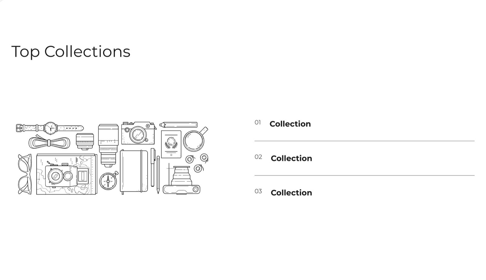
What this section controls
- The section heading and text.
- The picture beside the list.
- The collections in the list, with their names, text and links.
Getting started
1
Open the Theme Customizer
In your Shopify admin, open Online Store, then Themes, and click Customize next to Facet.
2
Add the section
In the Sections panel, click Add section and choose Collection highlights. The section can’t be added to the header or footer.
3
Pick the collections
Click each Collection block and choose a Collection. Click Add block, then Collection, to add more rows.
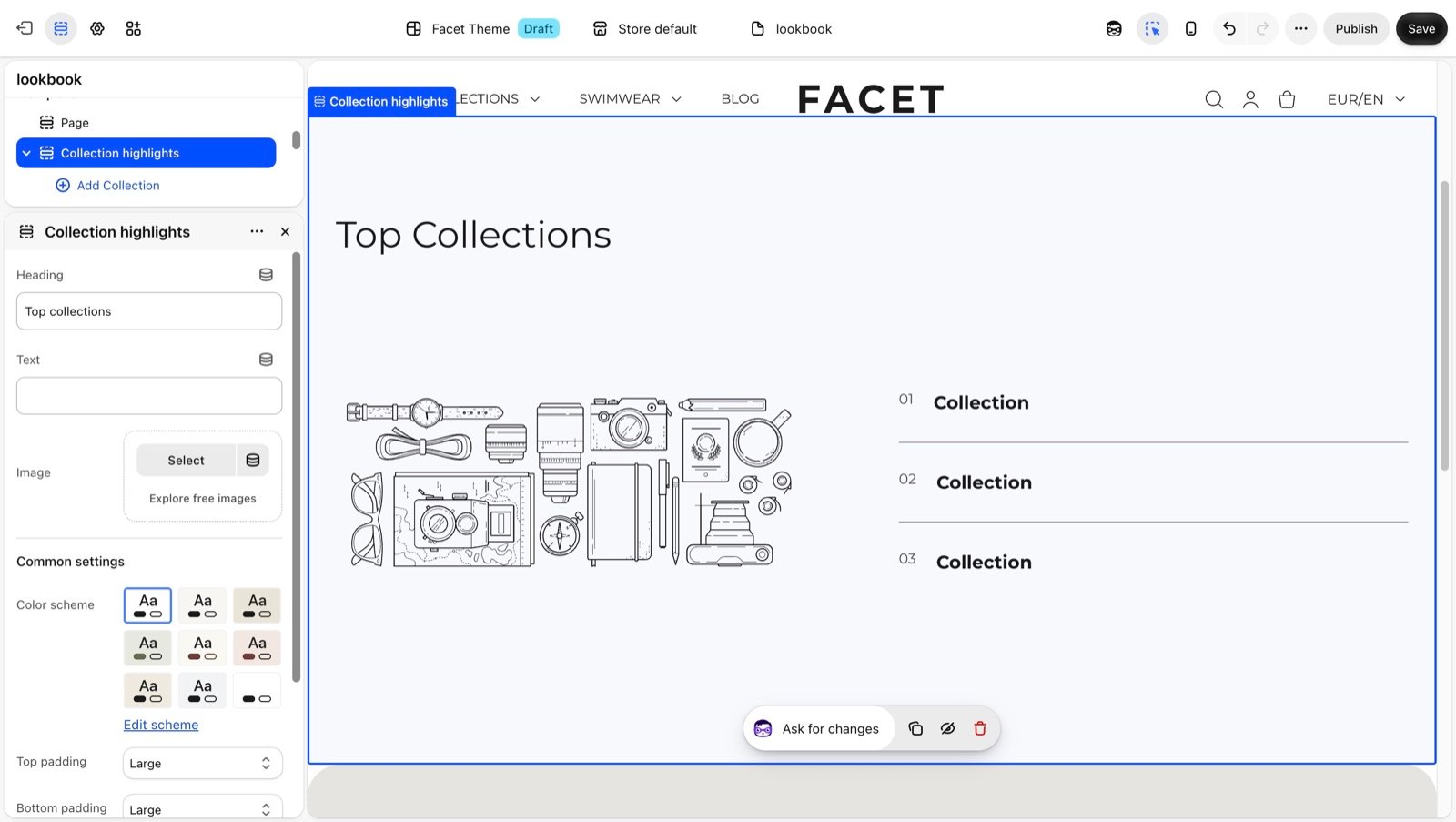
Section settings
Content
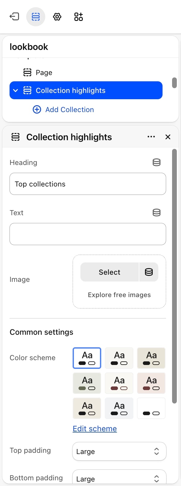
- Heading: the section heading. Default: “Top collections”. Leave it blank to hide it.
- Text: a short line under the heading.
- Image: the picture beside the list. Until you choose one, a placeholder shows. The picture uses the heading as its description for screen readers.
Common settings
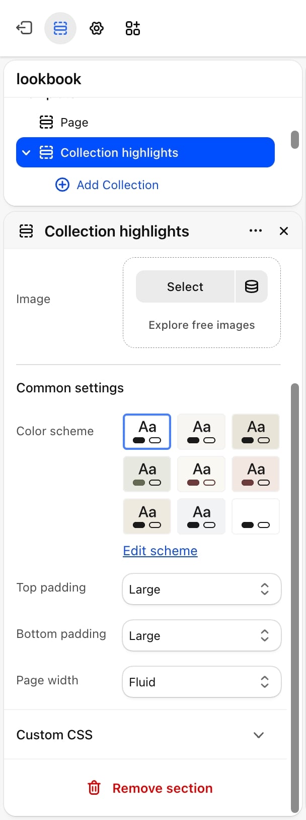
- Color scheme: the colors of the section.
- Top padding and Bottom padding: None, Small, Medium, Large (default) or Extra large.
- Page width: Narrow, Narrower, Fluid (default) or Full.
Blocks
Collection
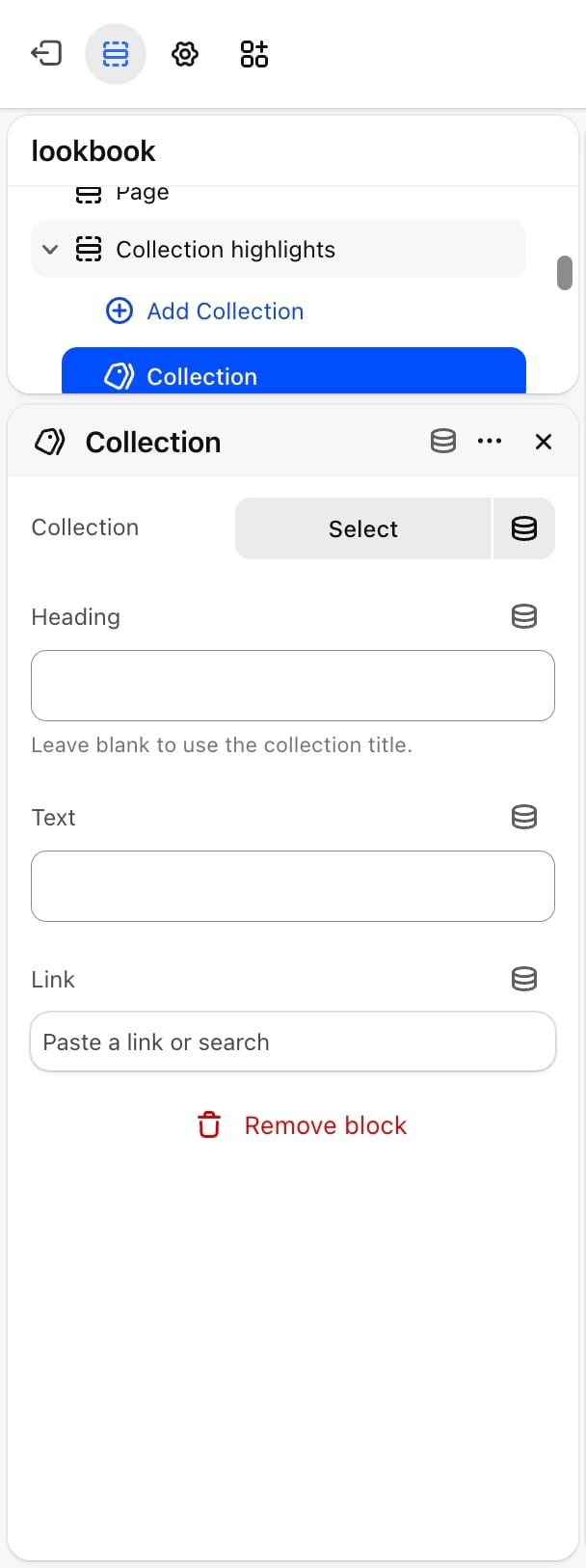
- Collection: the collection this row points to.
- Heading: the name shown on the row. Leave it blank to use the collection title.
- Text: a short line under the name.
- Link: where the row goes when clicked. Leave it blank to link to the chosen collection.
Best practices
- Keep the list short. Three to five rows keep the list about the same height as the picture.
- Use Text for a hook. A few words such as “New this week” give shoppers a reason to click.
- Choose a picture that fits every row. One picture sits beside the whole list, so pick one that represents your store, not a single collection.
Related guides
Collection page
Set up the page shoppers reach from each row.
Featured collection
Show the products of one collection instead of a list.