

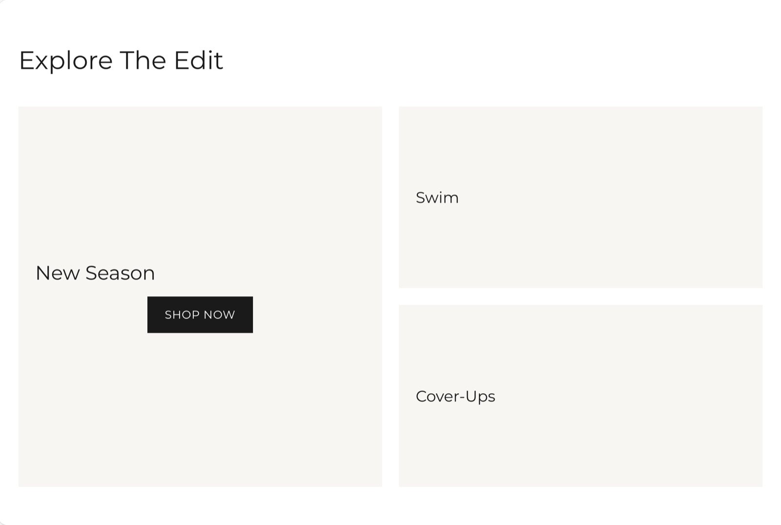
What this section controls
- The space between tiles.
- The order of tiles on phones.
- Each tile’s size, shape, media, colors and text position.
- Slideshow tiles and their slides.
Getting started
1
Open the Theme Customizer
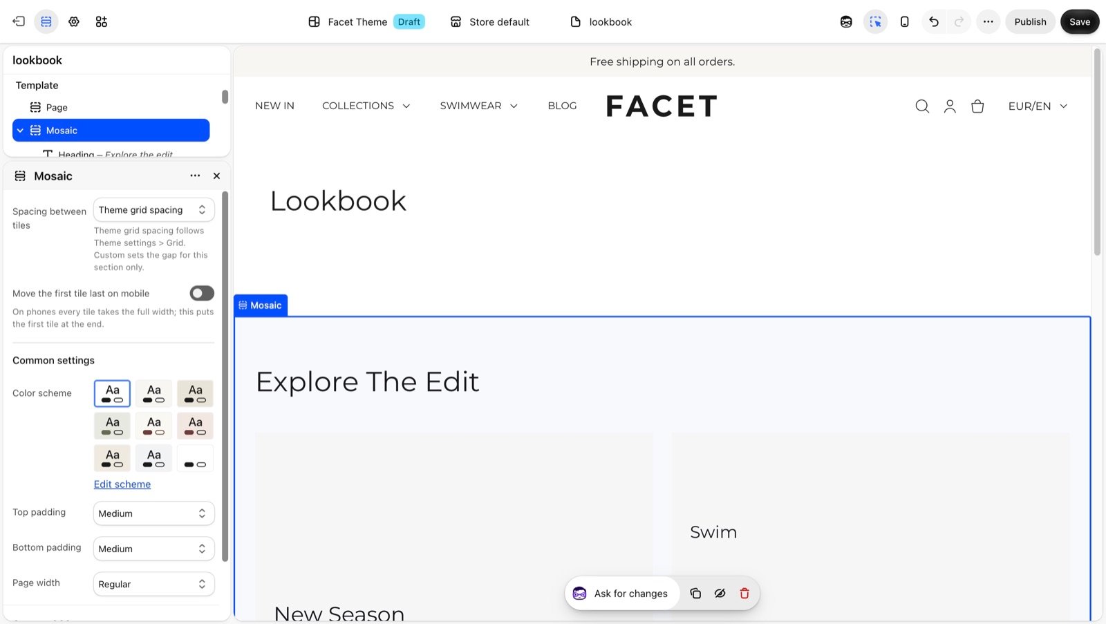
In your Shopify admin, open Online Store, then Themes, and click Customize next to Facet.
2
Add the section
In the Sections panel, click Add section and choose Mosaic. The section can’t be added to the header or footer.
3
Add tiles
Click Add block, then Mosaic tile or Mosaic slideshow. Set each tile’s Column span so the tiles in a row add up to 6.
4
Fill the tiles
Choose each tile’s picture or video, then edit the heading, text, button and label blocks inside it.
How the grid works
On screens 750 pixels wide and larger, the grid has 6 columns. A tile with a Column span of 3 takes half the width, and a span of 6 takes the full width. Tiles fill each row from left to right. A Row span above 1 makes a tile as tall as several rows, so smaller tiles can stack beside it. On phones, every tile takes the full width, one below the other.Section settings
Grid
Spacing between tiles
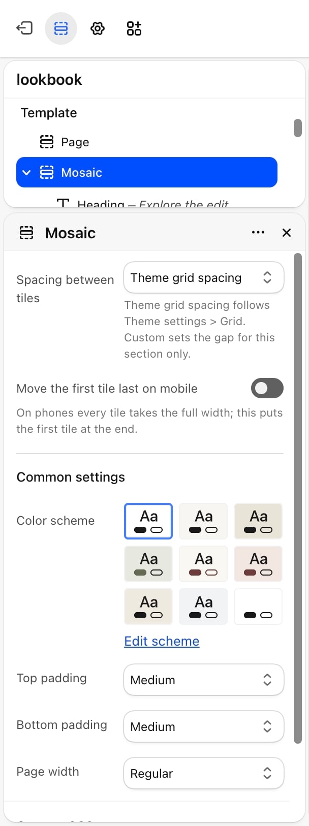
Spacing between tiles
- Theme grid spacing (default): uses the spacing set in Theme settings, then Grid.
- None: the tiles touch.
- Custom: sets the space for this section only, with the two settings below.
Desktop spacing and Mobile spacing
Desktop spacing and Mobile spacing
Desktop spacing: from 0 to 64 pixels. Default: 24. Mobile spacing: from 0 to 40 pixels. Default: 16. Both appear only when Spacing between tiles is Custom.
Move the first tile last on mobile
Move the first tile last on mobile
Off by default. On phones every tile takes the full width. This puts the first tile at the end, for example to show text tiles before a large picture.
Common settings
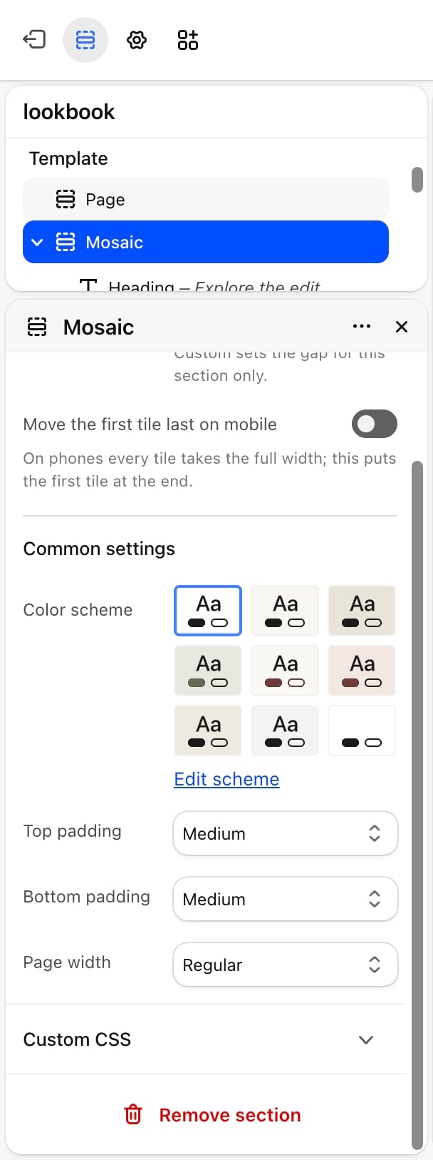
- Color scheme: the colors of the section behind the tiles. Each tile has its own color scheme.
- Top padding and Bottom padding: None, Small, Medium (default), Large or Extra large.
- Page width: Narrow, Narrower, Regular (default), Fluid or Full.
Blocks
Intro heading and text
The section has a fixed Heading and Text block above the grid. Their settings are described on Theme blocks.Mosaic tile
A tile with optional media and nested Heading, Text, Button and Label blocks. See Theme blocks for those.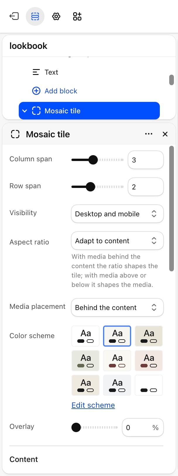
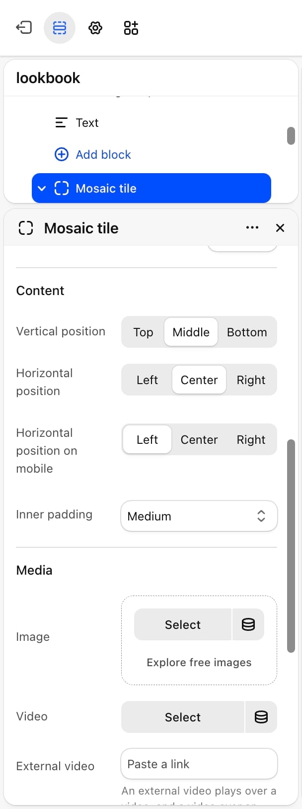
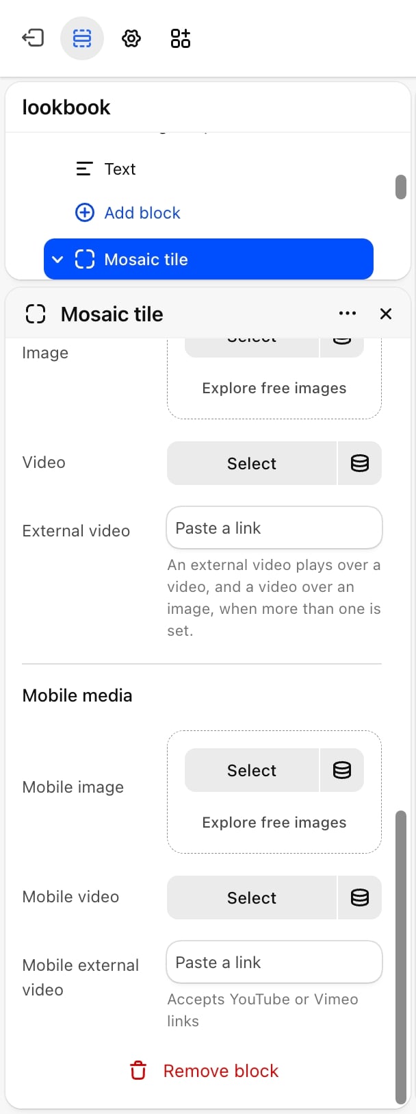
- Size and shape
- Colors and media placement
- Content
- Media
- Mobile media
- Column span: from 1 to 6. Default: 3.
- Row span: from 1 to 4. Default: 1.
- Visibility: Desktop and mobile (default), Desktop only or Mobile only. When every tile is hidden on a device, the section’s padding is removed there too.
- Aspect ratio: Adapt to content (default), Match the media, 1:1, 4:3, 3:4, 3:2, 2:3, 5:4, 4:5, 16:9, 9:16, 2:1, 4:1, 8:1 or 1:2. With media behind the content, the ratio shapes the whole tile. With media above or below, it shapes the media.
Mosaic slideshow
A tile that shows several slides, one at a time. It sits on the grid like a tile.- Size and colors
- Content
- Slideshow
- Column span: from 1 to 6. Default: 6.
- Row span: from 1 to 4. Default: 1.
- Visibility: Desktop and mobile (default), Desktop only or Mobile only.
- Media aspect ratio: the shape of the slide pictures: 1:1, 4:3, 3:4, 3:2, 2:3, 5:4, 4:5, 16:9, 9:16, 2:1 (default) or 4:1.
- Color scheme: the slideshow’s colors.
Slide
Each Slide block inside a slideshow is one slide, with nested Heading, Text, Button and Label blocks.- Image: the slide picture. The slideshow’s Media aspect ratio sets its shape.
- Media placement: Behind the content, Above the content (default) or Below the content.
Slides from metaobjects
With Slides come from set to Metaobject, the slideshow reads its slides from your store’s custom data instead of Slide blocks. This lets each product show its own slides on the product page. Each slide shows its picture on top, with the heading and text under it. Create this custom data once in your Shopify admin, under Settings, then Custom data:1
Create the metaobject definition
Under Metaobjects, add a definition with the type
multitile_media and these three fields:2
Create the product metafield
Under Products, add a metafield definition with the namespace and key
metaobject.multitile_slideshow. Set its type to Metaobject, choose your multitile_media definition, and allow a list of entries.3
Add entries
Under Content, then Metaobjects, add an entry for each slide. Then open a product and pick its entries in the new metafield, in the order the slides should show.
multitile_media entries with the handles default-1 to default-5 instead, in that order. Entries that don’t exist, or have no heading, text or picture, are skipped. Create these default entries so the slideshow is never empty.
Best practices
- Make each row add up to 6. Spans of 3 and 3, or 4 and 2, fill a row exactly. Rows that don’t add up leave a gap.
- Add mobile media for wide tiles. A tile that spans 6 columns on desktop is usually much shorter on a phone. A portrait crop keeps its subject large.
- Use Overlay for text on pictures. An overlay of 20 to 40% keeps white text readable on light pictures.
- Keep slideshows calm. At 5 seconds or more per slide, shoppers have time to read each one.
Related guides
Grid
Set the theme grid spacing the mosaic uses by default.
Theme blocks
Settings for the heading, text, button and label blocks in each tile.