

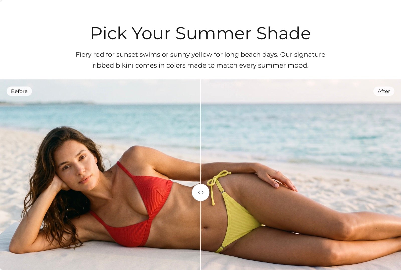
What this section controls
- The before and after pictures, with separate pictures for phones.
- The labels on each picture and where they sit.
- The shape of the slider.
- Whether the slider fills the width or sits beside your text.
Getting started
1
Open the Theme Customizer
In your Shopify admin, open Online Store, then Themes, and click Customize next to Facet.
2
Add the section
In the Sections panel, click Add section and choose Before and after. The section can’t be added to the header or footer.
3
Pick the two pictures
Click Before and after and choose a Before image and an After image.
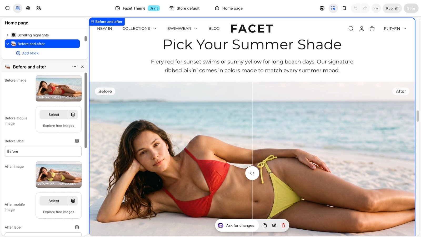
Section settings
Pictures and labels
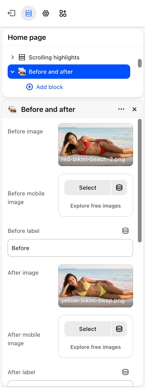
- Before image: the picture on the left side of the handle.
- Before mobile image: an optional picture for phones. Without one, phones show Before image.
- Before label: the tag on the before picture. Default: “Before”. Leave it blank to hide it.
- After image: the picture on the right side of the handle.
- After mobile image: an optional picture for phones. Without one, phones show After image.
- After label: the tag on the after picture. Default: “After”. Leave it blank to hide it.
- Label position: Top (default) or Bottom of the pictures.
Layout
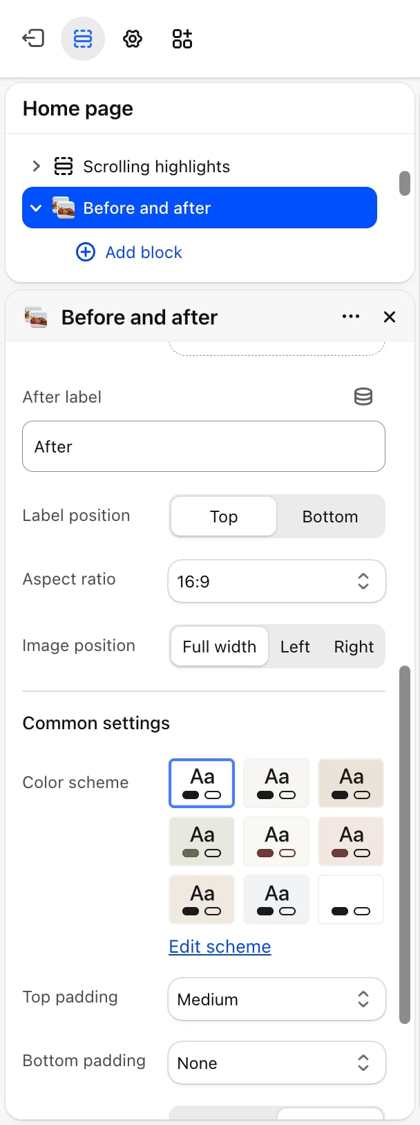
Aspect ratio
Aspect ratio
The shape of the slider: 1:1, 4:3, 16:9 (default), 21:9 or 3:4. Both pictures are cropped to this shape.
Image position
Image position
- Full width (default): the text blocks sit above the slider, and the slider takes the full width.
- Left or Right: on screens 750 pixels wide and larger, the slider sits on that side and takes about 60% of the width, with the text beside it. On phones the text sits above the slider.
Common settings
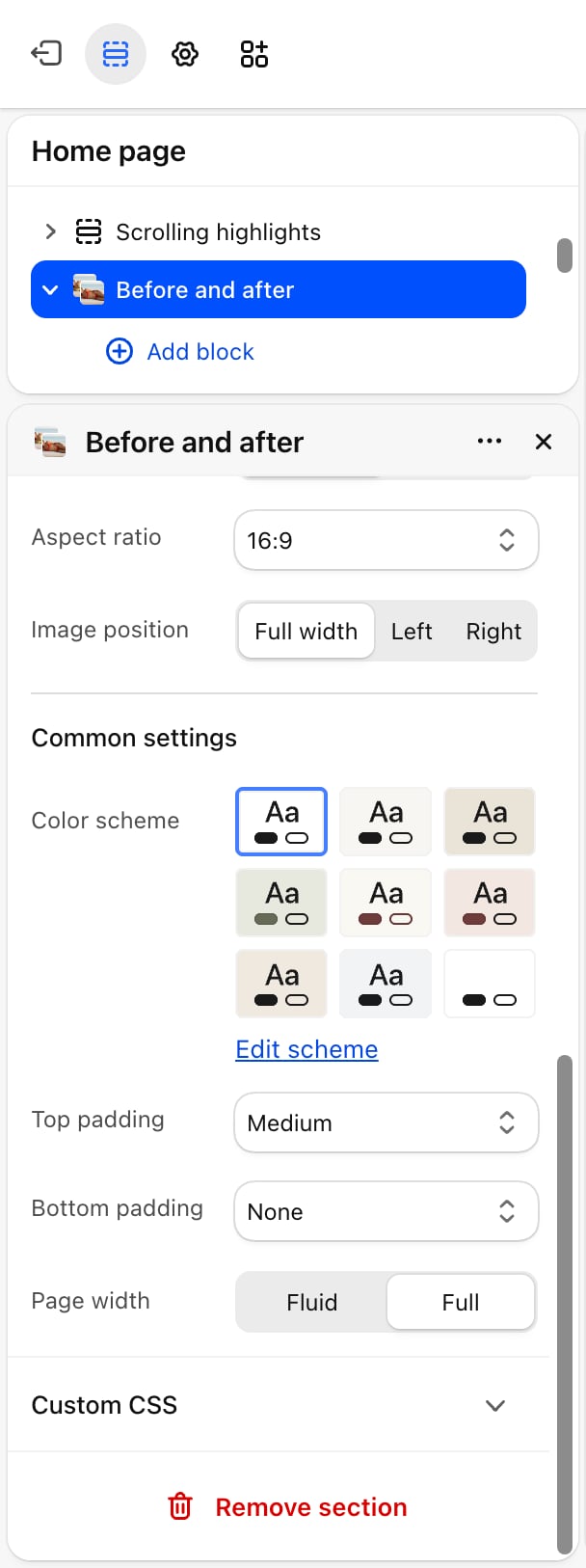
- Color scheme: the colors of the section.
- Top padding and Bottom padding: None, Small (default), Medium, Large or Extra large.
- Page width: Fluid (default) or Full.
Blocks
Heading, text and button
Add Heading, Text and Button blocks to explain the comparison. Their settings are described on Theme blocks. Without any blocks, the slider shows on its own.Best practices
- Shoot both pictures the same way. The same framing, light and distance make the difference easy to see as the handle moves.
- Crop both pictures to the same shape. Pictures with matching sizes line up exactly under the handle.
- Add phone pictures for wide shapes. With 21:9 or 16:9, a separate square or upright crop keeps the subject large on phones.
Related guides
Image with text
Show a single picture beside your text.
Theme blocks
Settings for the heading, text and button blocks.